Place Tooltips and Hotspots
Learn more about how to place tooltips and hotspots on elements in your application.
Table of Contents
Tooltips and Hotspots attach to elements in your application to guide users through features and workflows. Here's how to place them on visible elements, dynamic elements, and fine-tune their position.
Prerequisites
- The Appcues Builder is open on the page where you want to place your Tooltip or Hotspot.
- You've already created a Flow. See Create a Flow if you need to set one up first.
Add a Tooltip or Hotspot in the Builder
- Click the green + Add button > Tooltip/Hotspot group.
- Choose a template or start from scratch.
- Hover over the element you want to annotate. The element area highlights in green to show you what the pattern will attach to.
- Click to drop the Tooltip or Hotspot onto that element.

Auto-place a Tooltip
The Builder can automatically detect and attach a Tooltip to a target element using the Reposition Tooltip feature. This is the fastest way to place a Tooltip when the element is visible on the page.
- Add a Tooltip to your Flow.
- Click Reposition Tooltip in the Builder sidebar. The Builder enters targeting mode.
- Hover over the element you want to annotate. The element highlights in green.
- Click the element to auto-place the Tooltip. The Builder captures a CSS selector for the element and sets the alignment automatically.
If the Builder has trouble detecting the target element — common with dynamic selectors or complex UI frameworks — you'll need to fall back to manual placement. See Manually adjust the CSS selector below.
Change the alignment
When you place a Tooltip or Hotspot, the alignment is set automatically. To change it, select a different anchor point in the Placement tab. This controls which side of the element the pattern appears on.

Fine-tune the position
For precise adjustments, open the Placement tab and adjust the vertical and horizontal offset values. Enter positive or negative percentage (%) values to nudge the Tooltip or Hotspot until it's in the right spot.

Z-index conflicts
Sometimes a Tooltip or Hotspot looks cut off but is actually hidden behind another element — a sticky footer, a chat widget, or a fixed navigation bar. If the Tooltip appears partially obscured rather than truly clipped, increase the z-index value in the Placement tab. See How Appcues is overlaid for more on z-index.
Manually adjust the CSS Selector
When you place a Tooltip or Hotspot, the Builder captures a CSS selector for the target element. CSS selectors act as repeatable instructions that tell Appcues where to attach the pattern on the page. In some cases, you'll need to manually adjust the selector.
- Open the Placement tab.
- Click the Manual tab.
- Build your selector using the available checkbox options, or type a custom CSS selector directly.
- Add filters to narrow the match if needed:
- By order — use when multiple elements share the same CSS selector.
- By text — use when the target element always contains specific text.
For a deeper dive, see CSS Selectors.

Place on hidden elements
Hidden elements — like dropdown menus, dialogs, and popovers — only appear after a user interaction. You can still attach a Tooltip or Hotspot to these elements without adding a navigation step, as long as the interaction doesn't change the URL.
- Add a new Tooltip or Hotspot to your Flow.
- Hover over the area where the dynamic element will appear.
- Hold down SHIFT on your keyboard.
- While holding SHIFT, interact with the page to reveal the element (click to open a dropdown, hover to show a popover, etc.).
- Release SHIFT.
- Click the now-visible element to attach the Tooltip or Hotspot.

For a full walkthrough with multiple steps and navigation, see Use Tooltips in dropdown menus and dialogs.
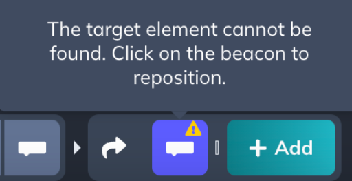
When editing a step where the target element isn't visible, the Builder shows a caution triangle (!) and a warning banner. This is expected — the element simply isn't in view at that moment. The warning disappears once the element is visible again, and the Flow displays correctly when live.
Scroll behavior
Tooltip and Hotspot Flows auto-scroll to the next step if the target element is offscreen. If the target element is already visible on screen, the Flow does not auto-scroll.
To force auto-scroll behavior, position your Tooltip or Hotspot as low on the page as possible so the next step falls below the visible area.

Fix Tooltips cut off on small screens or zoomed viewports
Tooltips can get clipped near the bottom of the screen, especially on laptops or when users have their browser zoomed in (e.g. 150%). This happens because the tooltip renders below the visible viewport edge. Here's how to fix it.
Switch to Auto placement
Auto placement is the most reliable fix. When set to Auto, Appcues dynamically chooses which side of the target element to display the Tooltip on, keeping it within the viewport. If your Tooltip is pinned to a fixed position like "bottom," switching to Auto in the Placement tab usually resolves the clipping.
Auto placement is the recommended default for Tooltips that need to work across different screen sizes and zoom levels. There is no dynamic "flip upward if the viewport is too short" control for fixed-position Tooltips — Auto is the only option that adapts consistently.
Adjust the vertical offset for fixed-position Tooltips
If you need the Tooltip to stay in a specific alignment (top, bottom, left, or right), adjust the % From Top value in the Placement tab. Lowering this value moves the anchor point higher on the target element, which shifts the Tooltip up and away from the bottom edge of the screen.
Confirm it worked
- Preview your Flow in the Builder to verify each Tooltip and Hotspot appears on the correct element.
- Check that hidden element steps display properly by interacting with the page during preview.
- Test the full Flow end-to-end on a live page to confirm scroll behavior and step progression.
If your Tooltip or Hotspot isn't showing
- Check that the CSS selector matches the target element. Open DevTools and verify the selector is correct. See CSS Selectors.
- If the element is inside an iFrame, build the Flow on the iFrame's source URL instead. See Using Appcues with iFrames.
- Elements inside SVGs are not currently supported.
- If the issue persists, see Why isn't a step showing?.