Create Pins
Learn more about Pins, a persistent experience type that provides quick and contextual help to your users.
Table of Contents
Build persistent, always-visible Pins that attach to elements in your product. You can create Icon w/ Tooltip Pins for contextual help or Button Pins that trigger Flows and link to URLs.
Prerequisites
- The Appcues Chrome Extension installed in your browser
- A Theme configured for your Pins (or use the default)
Create a Pin
You can start building a Pin from either the Chrome Extension or from Studio.
From the Chrome Extension:
- Navigate to the page in your app where you want the Pin to appear.
- Click the Appcues Chrome Extension icon in your browser toolbar. The Builder opens.
- Select Add a Pin, then Create New.
- Click + Add and choose Icon w/ Tooltip or Button.

From Studio:
- Go to Experiences > Pins in Studio.
- Click Create a Pin.
- Enter a name, build URL, and select a Theme, then click Create. A new tab opens with the Builder on your build URL.
- Click + Add and choose Icon w/ Tooltip or Button.

Icon w/ Tooltip Pins
Icon w/ Tooltip Pins display a small icon next to an element. When a user hovers over or clicks the icon, a tooltip expands with your content.

Place the icon
- After selecting Icon w/ Tooltip, choose an icon from the library or upload your own SVG.
- Enter Targeting Mode. Click any element on the page to anchor the Pin to it.
To place a Pin inside a dropdown menu, hold Shift while in Targeting Mode. See placing Tooltips for details.

Add content
- Click anywhere inside the green tooltip outline. The content block menu appears.
- Add content blocks — text, images, buttons, emojis, or custom HTML.
Style the tooltip
Tooltip styling is controlled by your Theme. Open your Theme and go to the Hotspot & Tooltips section to set the background color, font color, border radius, and shadow.
Custom CSS isn't supported in Pins at this time.

Style the icon
The icon color is set by your Theme by default. To override it per Pin, click the icon in the Builder to open the minibar. From there you can change the icon, adjust its color, resize it, or reposition it.

Set behavior
Open the sidebar menu to configure how the tooltip opens and closes.
Open trigger:
- On hover — The tooltip opens when a user hovers over the icon. It closes when the cursor moves away or the user clicks outside it.
- On click — The tooltip opens when a user clicks the icon. You can add a close option (X button or Dismiss link). Clicking outside the tooltip also closes it.

Pointer position:
- Auto — The tooltip pointer adjusts its position based on screen size automatically.
- Fixed — You set the pointer position manually.
Icon w/ Tooltip Pins open a tooltip when a user interacts with the icon.
If you select Icon w/ Tooltip, you'll be able to choose an Icon for your Pin or upload your own SVG icon.

Button Pins
Button Pins display a clickable button next to an element. They immediately trigger a Flow or navigate to a URL — no tooltip involved.

Place the button
- After selecting Button, choose a button style: Primary, Outline, Text link, or SVG icon.
- Enter Targeting Mode. Click any element on the page to anchor the Button Pin to it.

Style the button
Button styling inherits from your Theme. Open your Theme and go to the Buttons tab to set Primary and Secondary button styles.

To override styling per Pin, click the button in the Builder to open the minibar. You can change the button text, colors, border, and font directly.
Custom CSS is not supported in Pins at this time.
SVG icon buttons have a more limited minibar. To set the SVG size above the 100 display limit, type the value directly into the size field.

Set button actions
Each Button Pin has one action:
- Go to URL — Takes users to a static or dynamic URL. You can include profile attributes in the URL for personalization.
- Trigger Flow — Launches a Flow on the current page or a different URL. You can also include dynamic URL attributes.
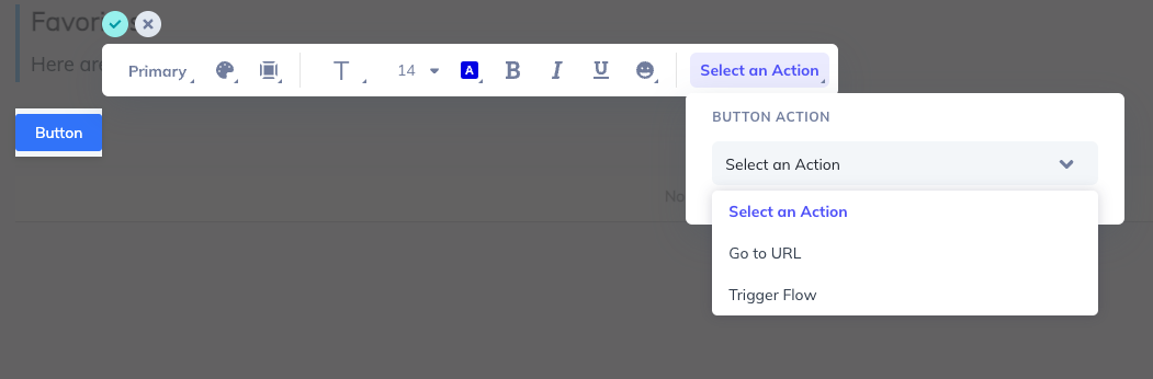
Optionally, enable Track event to capture clicks for analytics, or Update a user property to set a property value when the button is clicked.
Position and embedding
These settings apply to both Icon w/ Tooltip and Button Pins.
Embedding mode
Controls how the Pin is placed relative to its target element.
- Inline Right — Inserts the Pin into the page layout to the right of the target element.
- Inline Left — Inserts the Pin into the page layout to the left of the target element.
- Overlayed — Places the Pin on top of the target element without affecting page layout.
Allow content overlap
Available for Inline Right and Inline Left only. By default, inline Pins "make space" by expanding the target element. Enable Allow content overlap to place the Pin on top of the element instead — useful when placing a Pin on a button without changing the button's size.
Appcues selects a default for this toggle based on the target element. If the Pin isn't positioned as expected, try toggling this on or off.

Fine-tune position
Move the Pin vertically or horizontally by entering positive or negative values in px or % in the sidebar position controls.
Z-index
If your Pin is hidden behind other UI elements, increase its z-index. Open the sidebar and adjust the value — try 99999 or higher. See How Appcues is overlaid for more details.
Refine the target element
When you place a Pin, Appcues captures a CSS selector for the target element. If the selector doesn't work reliably (e.g., it uses dynamic classes or isn't unique), you can refine it.
- Click Refine Selection in the sidebar.
- Build a custom selector using the checkbox options, or type a CSS selector directly.
- Add filters to narrow the match: By order (when multiple elements share the same selector) or By text (to match specific text content).
- For a deeper guide on selectors, see CSS Selectors.

Confirm it worked
- The Pin appears on the correct element when you preview the page
- Icon w/ Tooltip: hovering or clicking the icon opens the tooltip with your content
- Button: clicking the button triggers the correct Flow (only works in live test, not preview) or navigates to the right URL
- The Pin displays correctly on different screen sizes
- See Preview and Test your Pin for testing steps before publishing
Troubleshooting
Pin doesn't appear on the page
- Verify Appcues is installed on the page. Open the Appcues Debugger and check for green checkmarks.
- Confirm the CSS selector matches a visible element. See Troubleshooting Pins.
Pin is hidden behind other elements
- Increase the z-index value in the sidebar position settings.
Tooltip is clipped or cut off
- If the Pin is inline inside a container with
overflow: hiddenoroverflow: auto, the container clips the tooltip. Move the Pin outside that container or switch to Overlayed embedding.
Pin disappears inside a dropdown menu
- Use Inline embedding so the Pin lives inside the menu's DOM tree. See Pins in dropdown menus.