Styling Flows and Themes
Learn how to style your Flows and create Themes for standardized and repeatable design content.
Table of Contents
This article covers Themes for Web Flows (legacy) and Pins. See New Themes and Styling for Flows 2.0, Banners, Embeds.
Moving to Flows 2.0 or Embeds? You can migrate your legacy Themes into the new Themes system. See Migrate a legacy theme.
The focus of our building experience is to provide you with great-looking defaults, so you can make Flow content quickly. But we also support much deeper customization of your styling - so you can make your content feel on-brand and native to your application (translation: it looks like it belongs there).
There are two tools you'll use to customize the appearance of your Flows: Themes and the Minibar.
How to create a Theme
From Studio, select Settings > Themes.

From the Theme's page, select Create Theme.

Using Themes
Themes are for creating standardized, repeatable Flow content in Appcues. We use them to allow our product designers to set up the defaults - it gives teammates more freedom to create messages. Now we know they will all look on-brand.
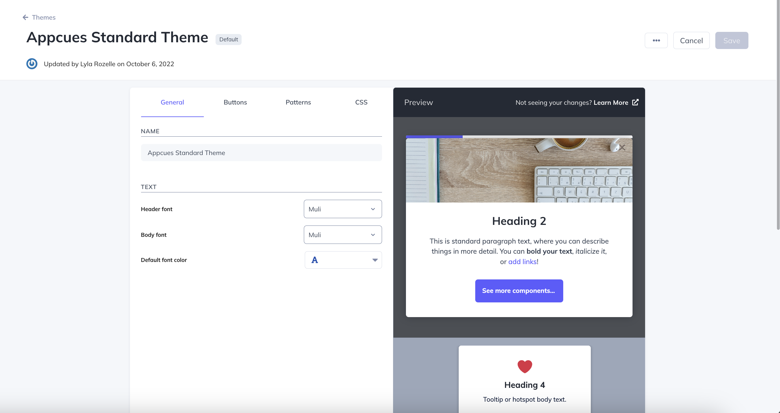
The Themes in your account include options for fonts, colors, and customizing things like backdrop opacity. You can even control the beacon appearance for Pins, Hotspots, and Tooltips! If you'd like to learn more about Themes inside your account, click here!
Managing your Default Theme
When your account is created, one of the Appcues Themes will be set as the default Theme. This Theme will be used as the Theme for any new Flows as they are created.
If you'd like to update the default Theme this can be done by selecting the three dots for the new Theme and selecting Set as default. This will make it so any new Flows that are created will use this Theme as the default Theme. This will not affect existing Flows.
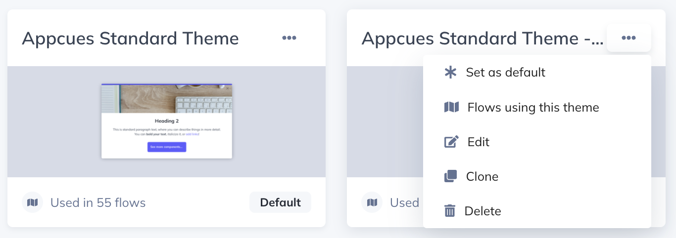
Editing the Themes that your existing Flows are using will impact those Flows as soon as you save, so be careful!
Adding Custom Fonts
Your Themes can also include your chosen typeface, imported using Google fonts, Typekit, or custom CSS. See this help article for more.
Using Custom CSS
When the options in Themes are not sufficient, you can also customize your Theme using custom CSS. The custom CSS section in Themes supports any CSS customization you may need. To target the appropriate selectors, please review this guide.
Custom CSS will take precedence over Theme settings adjustments. If you do not see your change in the preview, adjust your custom CSS.
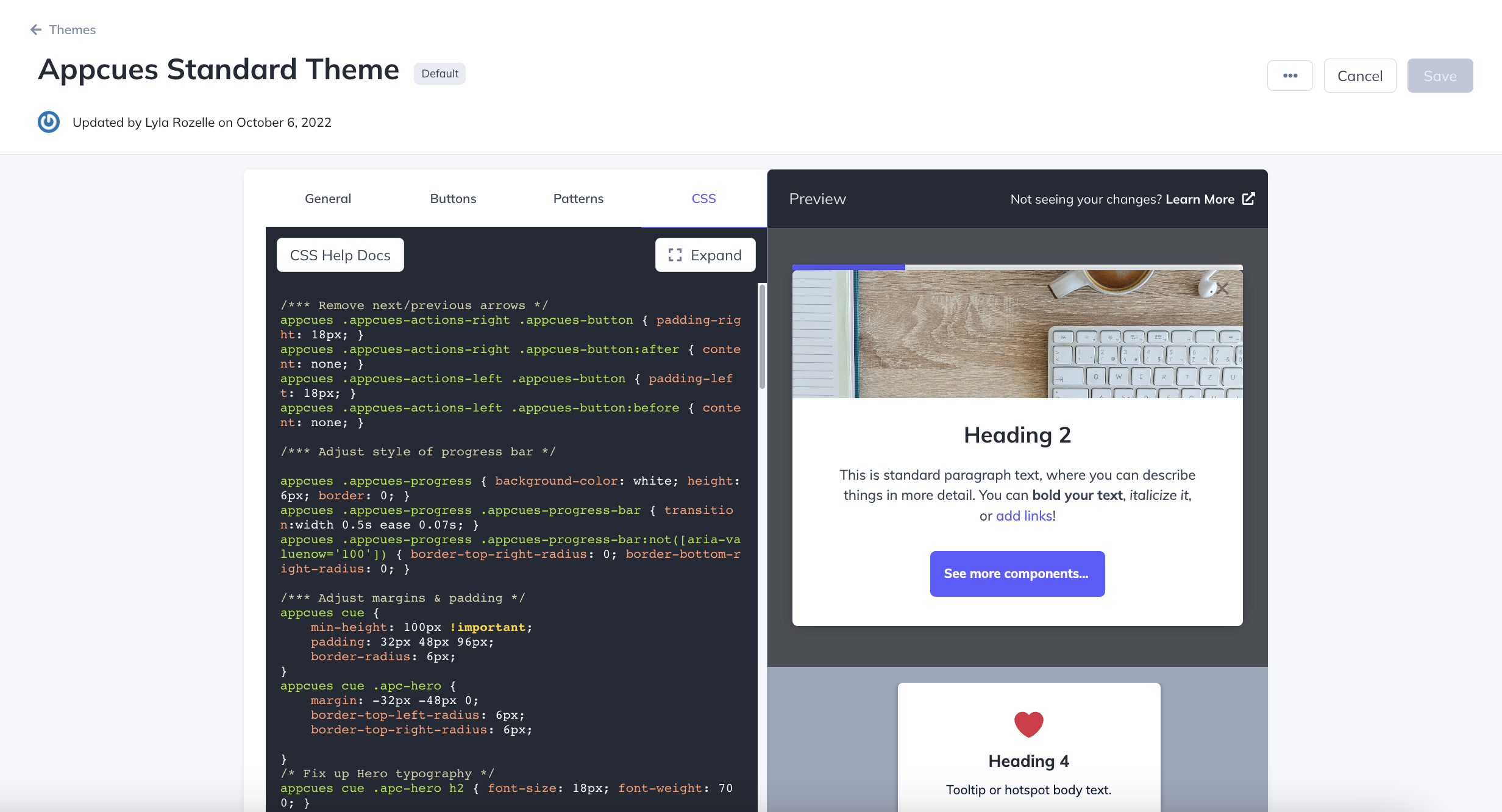
NOTE: Custom CSS does not apply to Pins at this time.
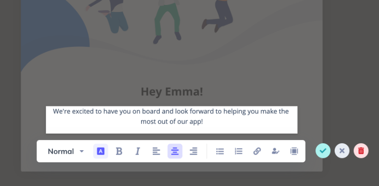
The Minibar
The Minibar is for styling components inside the Appcues Builder. For each component type, choose options like font style, alignment, and spacing.
Advanced Styling Options
Custom CSS for specific patterns
You can find below our help articles for specific CSS styling: