Mobile content blocks
The blocks you can add to mobile steps, and which patterns support each.
Table of Contents
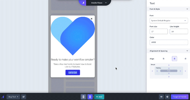
Content blocks are the pieces you assemble a mobile step from — text, images, buttons, surveys, and more. The same blocks are shared across Modals, Slideouts, Tooltips, and Embeds, though the available set varies by pattern (see Availability by pattern).
Add, delete, and reorder blocks
Add a content block by clicking the blue ➕ that appears when you hover above, below, or to the side of a step in step mode. To switch to step mode, click outside the step preview area, or click the step you're working on in the bottom builder bar.
Reorder blocks by hovering over a block that isn't being edited, then dragging it to a new position. To reorder an entire row, drag the handle that appears on the right of the row.
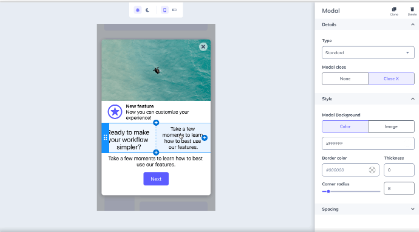
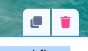
Click a block to display its controls. The copy icon creates a new copy of the block with its current contents and styling. The trash icon deletes the block.
Available blocks
Click a block to open its styling options in the builder sidebar. Depending on the block, you can adjust color, size, spacing, corner radius, and more.
- Appcues AI — AI-assisted building. To manage AI features in your account, contact support@appcues.com.
- Image/GIF — upload a PNG, JPG, SVG, or GIF. For best performance, use small optimized images (under 2 MB, 1620×1620). Reuse a previously uploaded image with Select from image gallery.
- Text — the font dropdown includes default iOS and Android options. Add a custom font with Add custom font list and enter the exact font name. Some custom fonts won't render in the builder, so use the preview functionality to see how it looks on a device. Once the SDK is installed, the Mobile Debugger shows which fonts are available in your app.
- Video — embed videos from YouTube, Wistia, or Vimeo. See Add Videos to Mobile Flows.
- Emoji — add an emoji, rendered using the device's native emoji library.
- Icon with Text — a customizable icon with a title and text.
- Hero/Header — a title, text, and background image.
- Text Input — a survey block for open-text responses.
- Single-select — a survey block where users select one response.
- Multi-select — a survey block where users select multiple responses.
- Rating — a survey block with Number, Star, and Emoji options.
-
Button — click the button text to edit it. Available button actions:
- Go to URL — enter a deep link (to another screen in your app) or a web link.
- Next Step — go to the next step in the Flow.
- Previous Step — go to the previous step in the Flow.
- Trigger Flow — select a published mobile Flow, and optionally redirect to another screen before it starts.
- Dismiss Flow — optionally choose Mark Flow Complete.
- Go to custom step — select any step in the Flow to jump to.
Availability by pattern
Not every block is available in every pattern:
- Modals, Slideouts, and Embeds support the full set of blocks above.
- Tooltips support a subset: Text, Image/GIF, Hero/Header, Icon with Text, Emoji, and Button. Video and survey blocks aren't available in Tooltips.