Create a Product Tour with Appcues
Discover the necessary steps to create a product tour that will help customers better understand your product.
Table of Contents
A product tour is a great way to quickly orient new users to your product, and it should:
- Show users where key features reside
- Stay high level, avoid going into much of the "how" to use your product
- Be concise
- End with a call to action (even if it's simply to close the tour)
The following video walks through building a product tour, and a text walkthrough is below.
Build Guide
Step 1: Add your first step
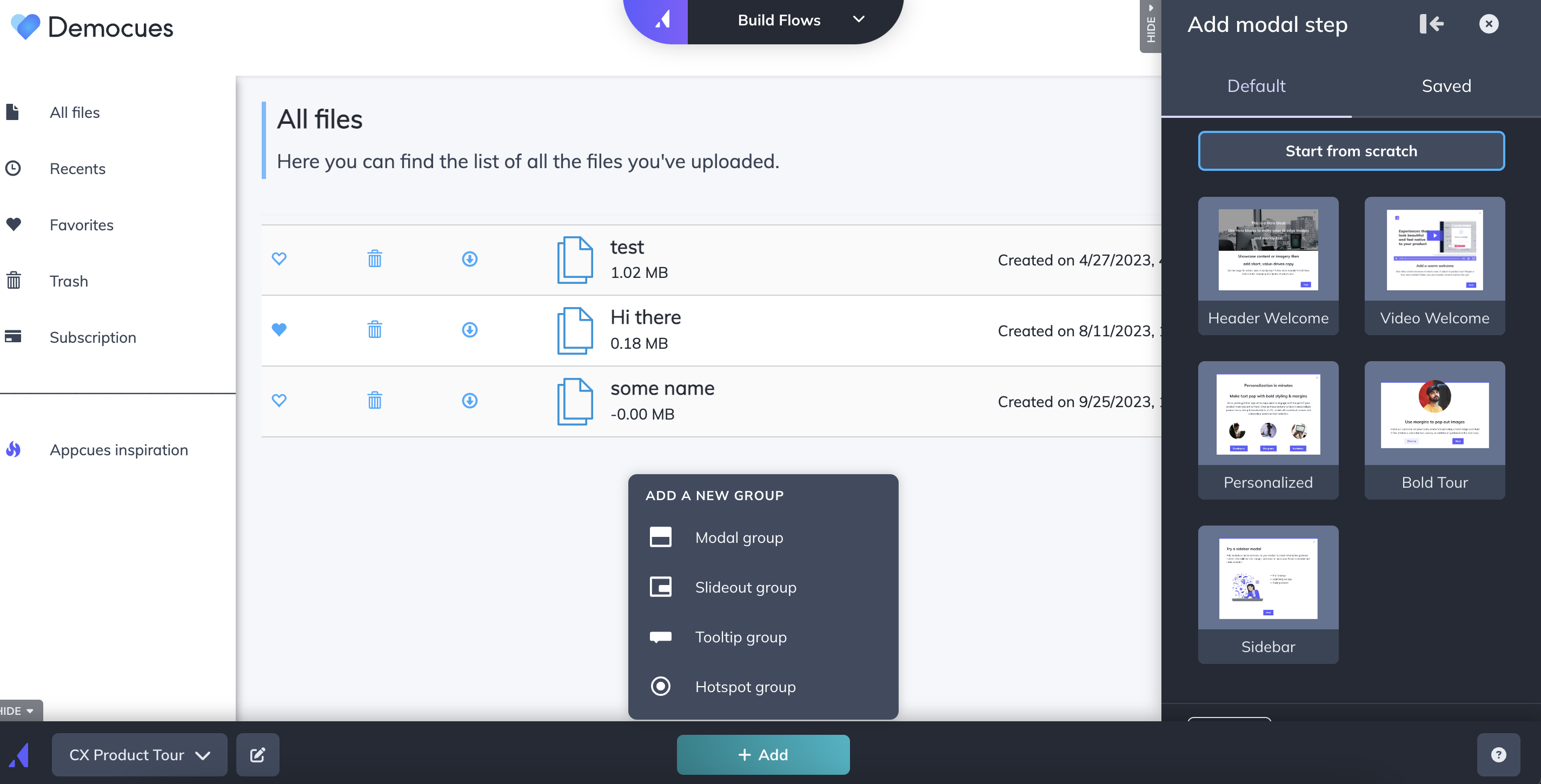
First, open the Appcues Builder to create a new flow and name it. Then, click on ‘+ Add’ and select ‘Modal Group’ + Start from Scratch:
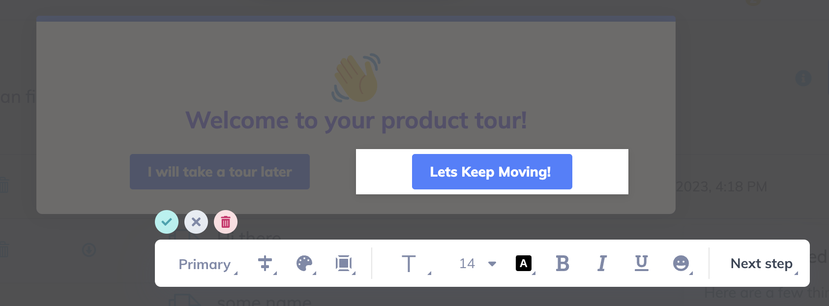
Now, add your desired blocks of content. These can be text, emojis, images, GIFs, and more. We'll start with an emoji, some text, and two buttons.
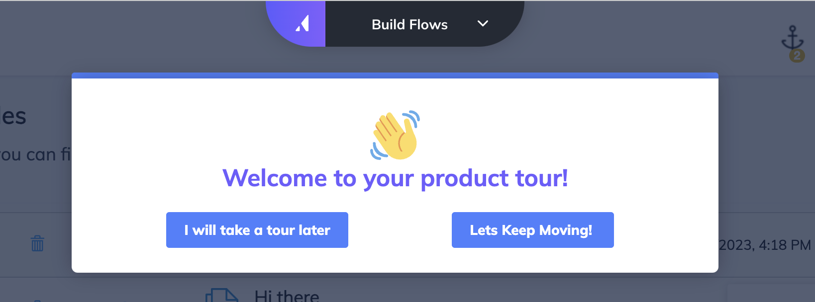
The button on the left side is set to dismiss the flow, allowing the users a way out.
The button on the right side is set to next, allowing the users to take the product tour.
Step 2: Add your tooltips
Now, you'll add a few tooltips showing the user around. For instance, in this tour, we'll add 3 tooltips showing different places on our app, like where to find favorites, the trash or where to upload a file.
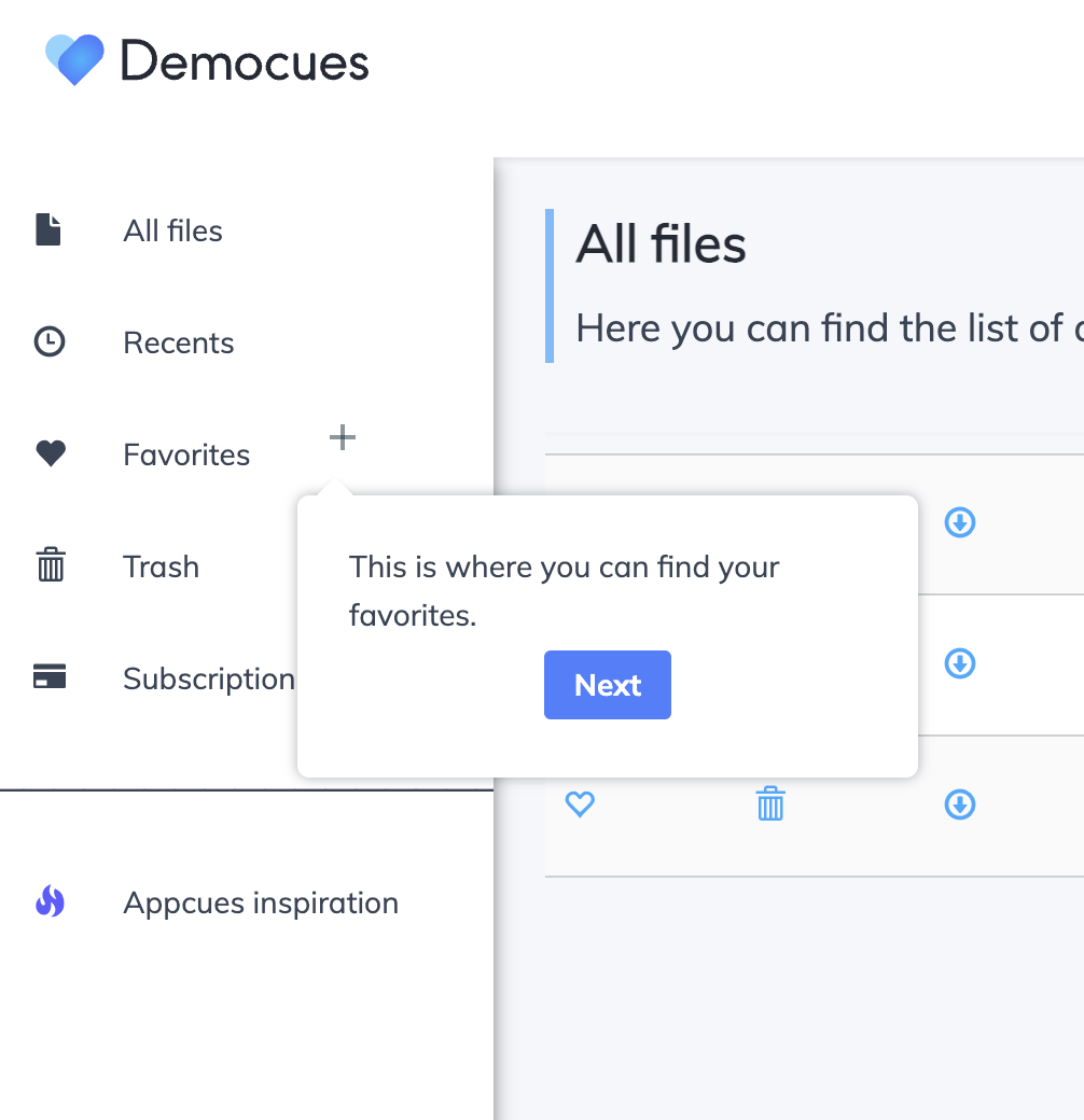
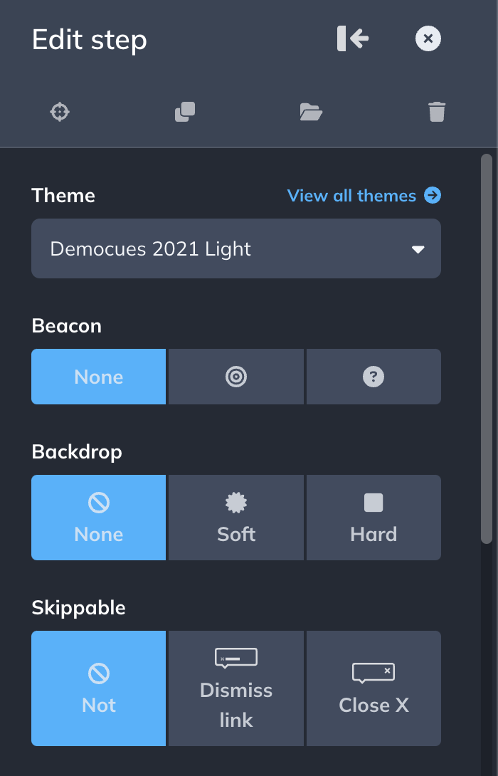
On the builder's side menu, you're also able to change the settings for the beacon, the backdrop, and the skip options. In our case, we're not using a beacon, no backdrop, and no skip option.
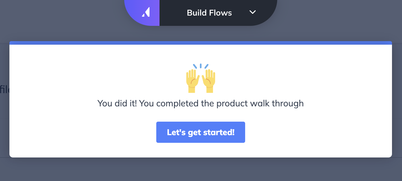
Step 3: Create a call to action
At the end of your tooltips, create a call to action. Add a modal, thank your users for taking the tour (if you'd like), and prompt them to take the next logical step.
Step 4: Target your flow
A product tour will often follow another piece of Appcues content. You can create a " Welcome Flow" that ends with the product tour getting triggered.
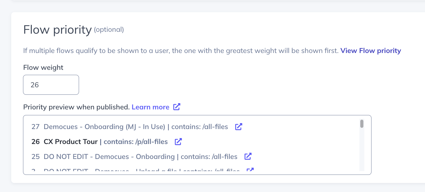
You can also adjust the Flow Priority of your flows so that the Product Tour only shows after the Welcome Tour is seen. You can do this by adjusting the flow weight on your flow's settings page:
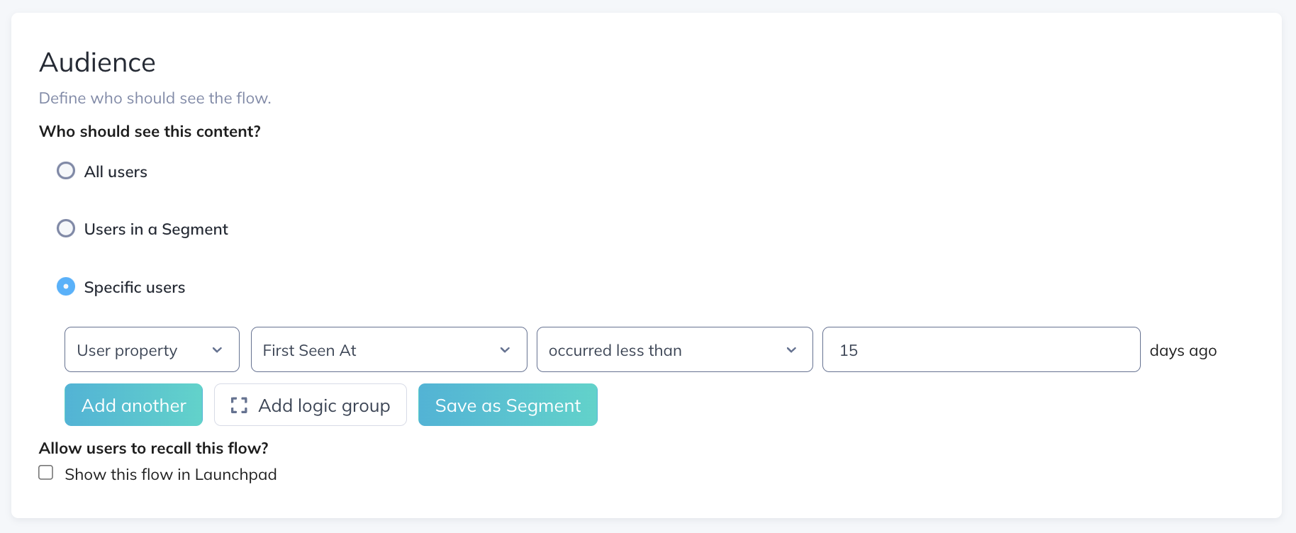
Now, in the audience, we want to make sure that it's only going to show to users who would likely find it helpful, i.e., new users. For that, Appcues offers a property that records the first time we see a user. We can, for instance, target users that were first seen in the last 15 days only: