Submit Article Requests

Do you have a suggestion for an article you would like to see created?
Feel free to submit this form and add your suggestions to our document board.

Please fill out the contact form below and we will reply as soon as possible.

  • Integration Hub
  • Contact Us
  • Docs home
  • Mobile Experiences
  • Building mobile experiences
  • Step & content types

Mobile Modals and Slideouts

Reference for mobile Modal and Slideout step types, content blocks, and styling.

Updated at July 14th, 2026

Submit Article Requests

Do you have a suggestion for an article you would like to see created?
Feel free to submit this form and add your suggestions to our document board.

Please fill out the contact form with the details about the help content you'd like to see.

  • Home

  • Getting Started

    • Appcues App

      • Installation & Developers

        • Web Experiences

          • Mobile Experiences

            • Workflows

              • Analytics & Data

                • Account Management

                  • Integrations

                    Table of Contents

                    Add, delete, and reorder content blocks Modal and Slideout step types Content blocks Style a modal Pin a block to the top or bottom

                    Modals and Slideouts are the step patterns you build mobile Flows from. This reference covers the step types available, the content blocks you can add to any step, and the styling options for each. Other mobile articles link here for content-block and step-type details.

                    Add, delete, and reorder content blocks

                    Add a content block by selecting the blue ➕ that appears when you hover above, below, or to the side of a step in step mode. To switch to step mode, click outside the modal preview area or click the step you're working on in the bottom builder bar.

                    Reorder blocks by hovering over a block that isn't being edited, then clicking and dragging it to a new position. To reorder an entire row, drag the handle that appears on the right of the row.

                    Reordering content blocks

                    Click a block to display its controls. The copy icon creates a new copy of the block with its current contents and styling. The trash icon deletes the block.

                    Block controls

                    Modal and Slideout step types

                    Step types control how a step is displayed on the device.

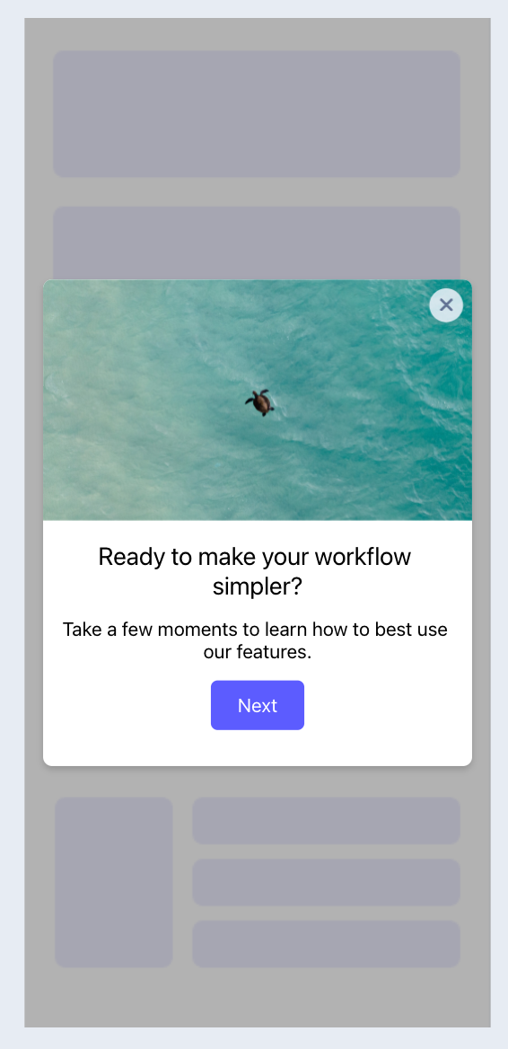
                    Standard — a modal with visual space on all sides.

                    Standard modal

                    Standard modals have a position control to align the experience to the top, center, or bottom of the screen.
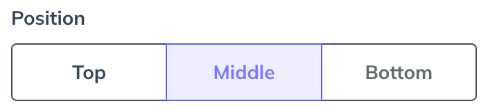
                    Standard modal position

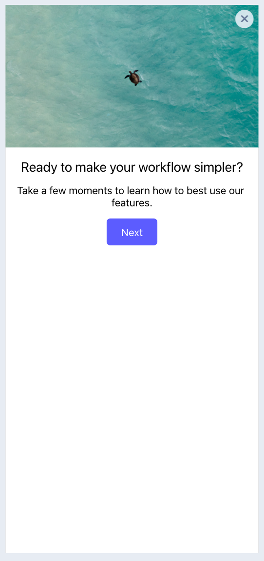
                    Full Screen — a modal that covers the entire screen.

                    Full screen modal

                    Half Screen — a modal aligned to the bottom of the screen with visual space above it.
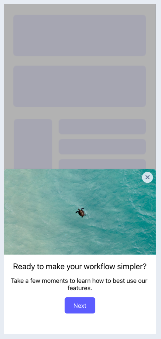
                    Half screen modal

                    Cover Sheet — a modal that covers most of the screen with minimal visual space at the top.
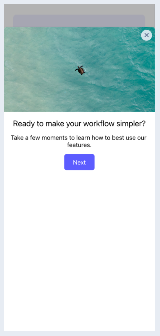
                    Cover sheet modal

                    Slideout (SDK 3.1+) — an unobtrusive experience with visual space on all sides that can be positioned in any primary quadrant of the screen.
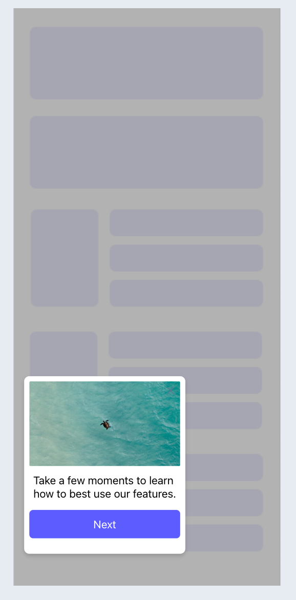
                    Slideout

                    The Slideout has a position setting to specify which quadrant it displays and animates from.
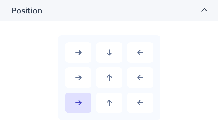
                    Slideout position

                    Content blocks

                    Click a block to open its styling options in the builder sidebar. Depending on the block, you can adjust color, size, spacing, corner radius, and more.

                    • Appcues AI — AI-assisted building. To manage AI features in your account, contact support@appcues.com.
                    • Image/GIF — upload a PNG, JPG, SVG, or GIF. For best performance, use small optimized images (under 2 MB, 1620×1620). Reuse a previously uploaded image with Select from image gallery.
                    • Text — the font dropdown includes default iOS and Android options. Add a custom font with Add custom font list and enter the exact font name. Some custom fonts won't render in the builder, so use the preview functionality to see how it looks on a device. Once the SDK is installed, the mobile debugger tool shows which fonts are available in your app.
                    • Video — embed videos from YouTube, Wistia, or Vimeo.
                    • Emoji — add an emoji, rendered using the device's native emoji library.
                    • Icon with Text — a customizable icon with a title and text.
                    • Hero/Header — a title, text, and background image.
                    • Text Input — a survey block for open-text responses.
                    • Single-select — a survey block where users select one response.
                    • Multi-select — a survey block where users select multiple responses.
                    • Rating — a survey block with Number, Star, and Emoji options.
                    • Button — click the button text to edit it. Available button actions:
                      • Go to URL — enter a deep link (to another screen in your app) or a web link.
                      • Next Step — go to the next step in the Flow.
                      • Previous Step — go to the previous step in the Flow.
                      • Trigger Flow — select a published mobile Flow, and optionally redirect to another screen before it starts.
                      • Dismiss Flow — optionally choose Mark Flow Complete.
                      • Go to custom step — select any step in the Flow to jump to.
                    Button actions

                    Style a modal

                    Modal styling options appear in the right sidebar. If you've clicked into a content block, click outside the modal in the preview pane to show the modal styling options.

                    • Position — Standard modals only. Sets the modal's vertical location (SDK 1.3+).
                    • Modal Close — choose the "X" in the top-right corner, or none (which requires an explicit close action button in the modal's content).
                    • Modal Color — pick from the color wheel or enter a hex code.
                    • Border Color + Thickness — Standard modals only. Set the color and border thickness.
                    • Background — add a background image for the entire modal.
                    • Step Indicator — show, hide, and customize the step indicators at the bottom of a modal.
                    • Corner Radius — adjust the slider or enter a number.
                    • Spacing — enter a number on the spacing matrix to adjust padding.
                    • Dark Mode — select the ☾ icon in the preview display settings or color selector. Colors set in this mode apply to users viewing the experience with dark mode enabled, based on their device settings. If no dark mode color is set, the light mode color is used.
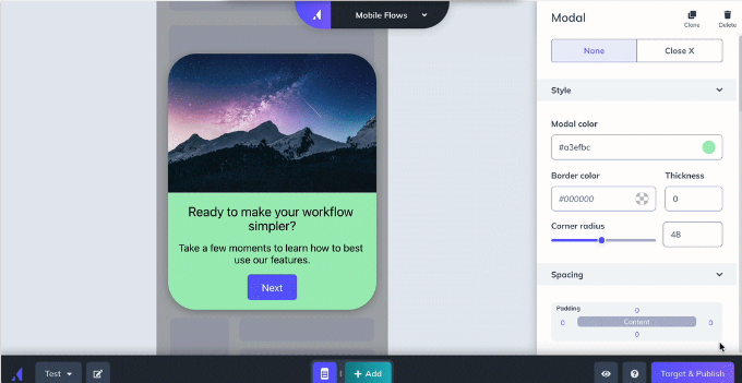
                    Modal styling options

                    Pin a block to the top or bottom

                    Supported in SDK 1.3+. The sticky option fixes a block or row in place so it stays put while other content scrolls. To make a row sticky, select any block in the top or bottom row and click the sticky pin. Adding a block to a sticky row makes that block sticky; removing a block from a sticky row updates it to the behavior of the row it moves to.
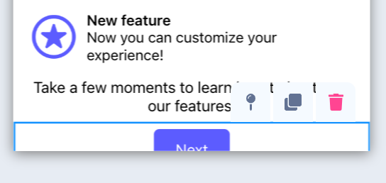
                    Setting a sticky row

                    To make a row no longer sticky, select any block in it and click the sticky pin again. Moving a sticky row to a new position — or moving another row into a sticky position — also removes the sticky behavior.
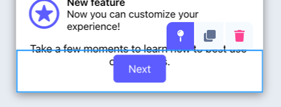
                    Removing a sticky row
                    modal design mobile style standard full screen half screen cover sheet slideout

                    Was this article helpful?

                    Yes
                    No
                    Give feedback about this article

                    Related Articles

                    • Mobile Tooltips
                    • Mobile Surveys
                    • Add Videos to Mobile Flows
                    • Mobile Custom Components
                    • Mobile Step Templates
                    Appcues logo

                    Product

                    Why Appcues How it works Integrations Security Pricing What's new

                    Use cases

                    Appcues Integration Hub User Onboarding Software Feature Adoption Software NPS & Surveys Announcements Insights Mobile Adoption

                    Company

                    About
                    Careers

                    Support

                    Developer Docs Contact

                    Resources

                    The Appcues Blog Product Adoption Academy GoodUX Case studies Webinar Series Made with Appcues

                    Follow us

                    Facebook icon Twitter icon grey Linkedin icon Instagram icon
                    © 2022 Appcues. All rights reserved.
                    Security Terms of Service Privacy Policy

                    Knowledge Base Software powered by Helpjuice

                    Expand