Customize Modals & Slideouts (CSS)
With a little extra CSS, you can enhance your Modals and Slideouts on top of the customization our basic style editor supports.
Table of Contents
If you're looking for CSS for Tooltips & Hotspots, please go to Customizing Tooltips & Hotspots.
Copy, paste, and edit the snippets below to take your flows to another level, but do not use body or html tags in the HTML component while building your flows as it may cause your flow to break or not show when the flow has been pushed live.
Note: our markup is subject to change. While we test our own styling operators across browser versions, we are unable to guarantee that your custom CSS will operate as expected.
Themes
The below snippets are formatted for use in the CSS section of the Theme that you'll be applying to your flow. Go to the Theme you're using and on the CSS tab, add the CSS that you need to style your Flows.
Note that any CSS added applies to all the live flows using the Theme. In some cases, we recommend that you create separate Themes with specific styling for quick use.

HTML Blocks
If you'd like to use any of these snippets to style a particular step (such that other steps aren't affected), wrap any of the below snippets in a <style> tag and place them in an HTML component of the step you'd like to modify. For example:
<style> /* Insert snippet below for step level use =) */
</style>
Pattern Specific Selectors
If you want to change the style of just Modals, or just Slideouts, without changing the other patterns, you can select each pattern specifically to modify its styles. appcues[data-pattern-type=modal] selects Modals only, while appcues[data-pattern-type=shorty] selects Slideouts. You can then add style rules within those to apply only to Slideouts or Modals.
Modals
The following selector will allow you to make styling changes to the outer element of a modal.
appcues[data-pattern-type=modal] cue {
	/* Add styling here */
}
Adjusting the width
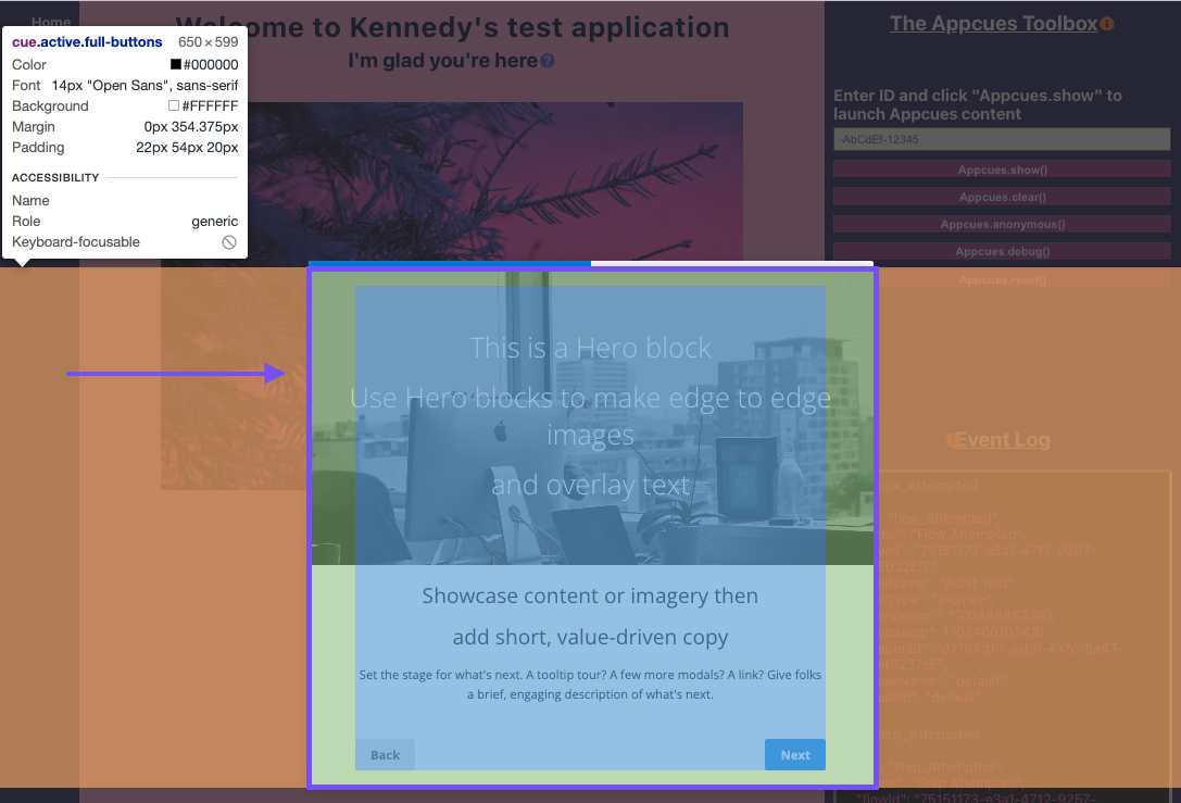
Modals default to 650px wide. You can adjust the default width of Modals to make them larger or smaller using the following code.
Please note that there is an upper limit to the size of Modals. To circumvent this, change the "min-width" to the desired size as well, as shown below.
/* To make a modal slightly wider */
appcues[data-pattern-type=modal] cue, appcues[data-pattern-type=modal] > div {
    width: 720px;
    min-width: 720px;
}

/* To make modals slightly narrower */
appcues[data-pattern-type=modal] cue, appcues[data-pattern-type=modal] > div {
    width: 580px;
    min-width: 580px;
}
Adjusting the height
Sometimes, you want a consistent height for all Modals or Modal steps. To accomplish that, use the following.
appcues[data-pattern-type=modal] cue {
    height: 420px;
    min-height: 420px;
}
If you want to make the height of the container smaller than the contents you'll want to make sure that the Modal is set to automatically add a scroll bar if needed.
appcues[data-pattern-type=modal] cue {
    overflow-y: auto;
    height: 480px;
    min-height: 0px;
}
Slideouts
Adjust the width
/* To make slideouts slightly wider */
appcues[data-pattern-type=shorty] modal-container, cue {
    width: 800px;
    min-width: 800px;
}

/* To make slideouts slightly narrower */
appcues[data-pattern-type=shorty] modal-container, cue {
    width: 580px;
    min-width: 580px;
}
Adjust the height
appcues[data-pattern-type=shorty] cue {
    height: 480px;
    min-height: 0px;
}
If you want to make the height of the container smaller than the contents you'll want to make sure that the Slideout is set to automatically add a scroll bar if needed.
appcues[data-pattern-type=shorty] cue {
    overflow-y: auto;
    height: 480px;
    min-height: 0px;
}
General Selectors
Styling Links
You can style links within your Modals and Slideouts only…
/* Adjust links within Modal/Slideout
appcues cue section a[data-step], appcues cue section a[href]{
	color: #3388ee; /* Choose your link color here */
}

/* Adjust styling when hovering over link */
appcues cue section a[data-step]:hover, appcues cue section a[href]:hover {
	color: #1166cc;
    text-decoration: underline; /* Adds underline to link on hover */ */
}
…or you can change link styling for all of your patterns (Modals, Slideouts, Tooltips, Hotspots) at once!
appcues cue section a[data-step], appcues cue section a[href], .tooltip p a[data-step], .tooltip p a[href] {
    color: #3388ee;
}
appcues cue section a[data-step]:hover, appcues cue section a[href]:hover, .tooltip p a[data-step]:hover, .tooltip p a[href]:hover {
    color: #1166cc;
    text-decoration: underline;
}
Styling the Progress Bar
appcues .appcues-progress-bar {
background-color: #CA16D6; /* change fill color of the progress bar */
}
Form Text Input

 /* Change the color of the small input text */
appcues cue .form-field-text input { color: #CA16D6 !important; }

/* Change the color of the large input text */
appcues cue .form-field-textarea textarea { color: #CA16D6 !important; }
Form Labels
/* Make form label font size bigger */
appcues cue > section .step-action-form label.label-display, appcues cue > section .form-field label.label-display {
font-size: 20px;
}
Ratings and Radio Buttons
By default, the rating option starts at 0 and increments up.
For surveys and forms, it's common to want to have the selectable options start at 1 and increment from there.
To switch to this styling you can add the following CSS to the Theme that you're using.
.rating-options .rating-option:first-of-type {
display:none;
}
To style ratings:
 /* Rating span */
appcues cue > section .form-field .rating-option span {
	background-color: blue;
	border: 1px solid #777;
}
/* Rating span hover */
appcues cue > section .form-field .rating-option span:hover {
	background-color: orange;
	border: 1px solid #777;
}

  /* Rating span after selected */
appcues cue > section .form-field .rating-option input[type=radio]:checked + span {
	background-color: orange;
	border: 1px solid #777;
}

  /* Rating selection text */
appcues cue > section .form-field .rating-option span {
	font-size: 30px !important;
	color: green !important;
}

 /* Rating helper text right */
appcues cue > section .form-field .rating-labels .right small {
	font-size: 18px;
}

  /* Rating helper text left */
appcues cue > section .form-field .rating-labels .left small {
	font-size: 18px;
}
To change the color of the radio select buttons:
/*Change radio select input color*/
appcues cue>section .form-field label.field-option input[type=radio]:checked+span:before {
	background-color: green;
}
Multi-Select
Multi-select checkboxes:
/*Unselected checkbox*/
appcues cue > section .form-field label.field-option input[type=checkbox] + span::before{
  background-color: white;
}

/*Selected checkbox*/
appcues cue > section .form-field label.field-option input[type=checkbox]:checked + span::before {
  background-color: blue;
}
Multi-select option labels:
/*Unselected option label*/
appcues cue > section .form-field label.field-option input[type=checkbox] + span{
  color: grey;
}

/*Selected option label */
appcues cue > section .form-field label.field-option input[type=checkbox]:checked + span{
  color: black;
}
Changing the style of the Skip X
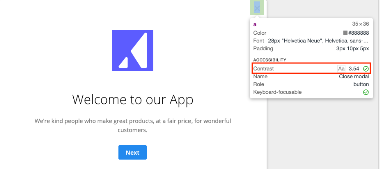
If you choose "Skippable" in the Flow Editor, then a Skip X appears in the upper right. You can adjust the style of the Skip X to better contrast with your application with:
/* This will remove the background and change the color of the X */
appcues .appcues-skip > a {
    background: none;
    right: 6px; /* Change the placement of the X */
    font-size: 28px;
    color: #cccccc; /* A medium gray -- update as needed */
    opacity: 0.5;
}

appcues .appcues-skip > a:hover {
    /* Make non-transparent when mouse is over */
    opacity: 1;
}
Accessibility Tip: You can check the contrast ratio of your skip X using the Chrome DevTools. To do this, open your flow in the Appcues Builder, open the Chrome DevTools (Menu → More Tools → Developer Tools), Click the Inspect icon in the top-left corner of DevTools, and move your mouse pointer over the Close 'x'. Accessibility requirements suggest a contrast of at least 4.5.
More CSS Tricks 🪄
Modal: Center a Modal
The following CSS moves Modals to the middle of the screen.
appcues[data-pattern-type=modal] {
   display: flex;
   flex-direction: column;
   align-items: center;
   justify-content: center;
}
Note: To center a slideout, choose “Centered” for the position in the Flow Editor.
Modal: Rounded Modal
Note: This will ONLY work for Modals. This CSS will not have the same effect for Slideout patterns.
/* Note: make sure to unselect Show progress bar in step settings or hide the progress bar in your Theme CSS first. */
appcues cue .apc-hero {
   border-top-left-radius: 18px; /* If you're using a hero, adjust these numbers*/
   border-top-right-radius: 18px;
}
appcues cue {
   border-radius: 18px; /* This is the roundness of the borders */
}
modal.container-fullscreen, modal.container, .appcues-progress, .appcues-skip, .active {
   box-shadow: none;
}
.appcues-skip > a { /* This section affects your 'skippable' button in the top-right if it appears */
   border-top-right-radius: 18px; /* Match your chosen radius here */
}
You can choose "Round" for Button Roundness in your Theme to match.
Modal/Slideout: Squared corners
By default, Modals and Slideouts have slightly rounded top corners. To make them completely squared off instead, add the below CSS snippet.
appcues cue, appcues .appcues-progress {
border-radius: 0;
}
Modal: Full-Screen
The following styling rules will allow a Modal to cover the width and height of the screen.
/* To make modal width of the screen */
appcues[data-pattern-type=modal] cue, appcues[data-pattern-type=modal] > div {
    width: 100vw;
    min-width: 100vw;
}

 /* To make modal height of the screen */
appcues[data-pattern-type=modal] cue {
    height: 100vh;
    min-height: 100vh;
}

/* Remove padding from modal container */
appcues[data-pattern-type=modal] {
    padding: 0 !important;
}
Modal: Sticky header and scrollable content
To create a header that remains at the top of a modal with scrollable content, you will need to use the custom HTML block and a combination of HTML and CSS.
First, add a text block to the modal to create your header.
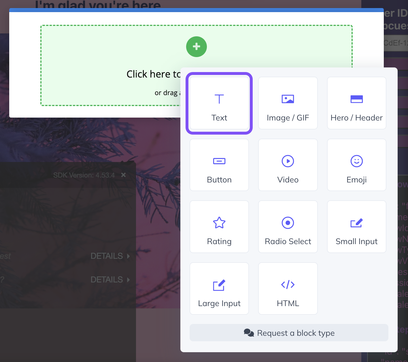
Then, below the header, insert an HTML block.
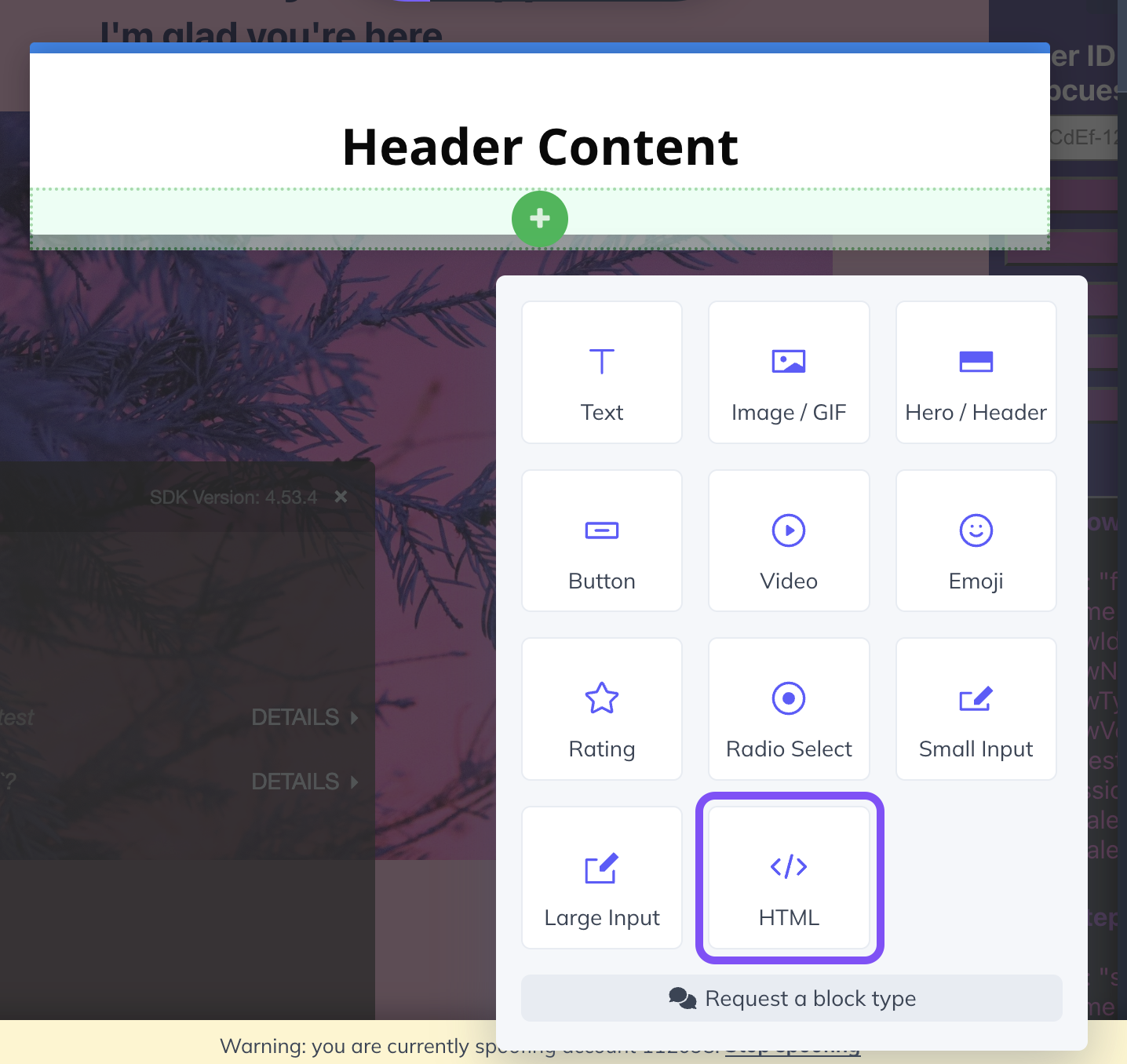
Inside the HTML block, you'll want to have a section for your styling and a div to wrap around your content. In the <style> section, you'll need to set the height of the scroll container and set "overflow-y" to "scroll" to create scroll bars.
You can place the scrollable content inside of the <div></div> section.
<style>
#scroll-container {
height: 400px !important; /* Set Height */
overflow-y: scroll; /* Set Overflow-y to scroll */
}
</style>
<div id="scroll-container">
/* Add lots of content here! */
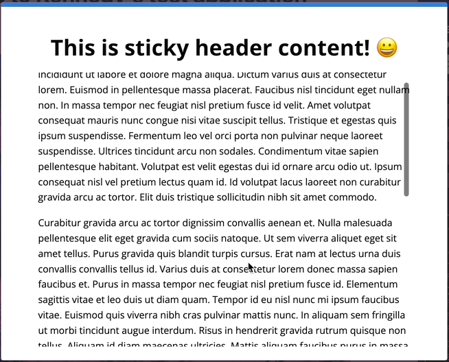
</div>Afterward, your Modal should look something like this:
Modal/Slideout: Cover the background with an image
For both modals and slideouts:
appcues cue {
    height: 100%;
    width: 100%;
    background-image: url(/*add image URL*/);
    background-size: cover;
    background-position: center;
}
Modal only:
appcues[data-pattern-type=modal] cue {
    height: 100%;
    width: 100%;
    background-image: url(/*add image URL*/);
    background-size: cover;
    background-position: center;
}
Slideout only:
appcues[data-pattern-type=shorty] cue {
    height: 100%;
    width: 100%;
    background-image: url(/*add image URL*/);
    background-size: cover;
    background-position: center;
}
Modal: Blur backdrop
appcues[data-pattern-type=modal] {
  backdrop-filter: blur(5px);
}
Modal: Add transition animation
appcues[data-pattern-type='modal'] {
	transition: opacity 0.5s, transform 0.5s:
}

appcues[data-pattern-type='modal'].apc-hidden {
	transform: scale(0.2) rotate(-825deg);
}
Modal: Adding confetti
You can add confetti to your Modals and Slideouts (updating the data-pattern-type to shorty from modals) with the following styles!

<style>
.appcues-backdrop[data-pattern-type="modal"] {
  opacity: 0.8 !important;
}
.appcues-backdrop::before,
.appcues-backdrop::after {
  content: "";
  position: absolute;
  top: 0;
  left: 0;
  right: 0;
  bottom: 0;
  pointer-events: none;
  background-repeat: repeat;
}
.appcues-backdrop::before {
  background-image: url("data:image/svg+xml;charset=UTF-8,%3Csvg%20xmlns='http://www.w3.org/2000/svg'%20width='200'%20height='200'%20viewBox='0%200%20200%20200'%3E%3Ccircle%20cx='30'%20cy='30'%20r='5'%20fill='%23FC96DF'/%3E%3Ccircle%20cx='170'%20cy='40'%20r='3'%20fill='%23B0F2F4'/%3E%3Ccircle%20cx='100'%20cy='180'%20r='6'%20fill='%239D8FFF'/%3E%3Crect%20x='80'%20y='20'%20width='12'%20height='4'%20fill='%23FC96DF'%20transform='rotate(15%2086%2022)'/%3E%3Crect%20x='20'%20y='150'%20width='8'%20height='3'%20fill='%23B0F2F4'%20transform='rotate(-10%2024%20151.5)'/%3E%3Cpolygon%20points='150,150%20155,160%20145,160'%20fill='%239D8FFF'/%3E%3Cpath%20d='M50,100%20Q55,95,60,100%20T70,100%20L70,105%20Q65,110,60,105%20T50,105%20Z'%20fill='%23B0F2F4'/%3E%3C/svg%3E");
  animation: confetti-fall 5s linear infinite;
  opacity: 0.9;
}
.appcues-backdrop::after {
  background-image: url("data:image/svg+xml;charset=UTF-8,%3Csvg%20xmlns='http://www.w3.org/2000/svg'%20width='200'%20height='200'%20viewBox='0%200%20200%20200'%3E%3Ccircle%20cx='50'%20cy='50'%20r='3'%20fill='%23B0F2F4'/%3E%3Ccircle%20cx='130'%20cy='70'%20r='2'%20fill='%239D8FFF'/%3E%3Crect%20x='100'%20y='30'%20width='8'%20height='3'%20fill='%239D8FFF'%20transform='rotate(10%20104%2031.5)'/%3E%3Cpolygon%20points='60,160%2063,165%2057,165'%20fill='%23FC96DF'/%3E%3Cpath%20d='M120,120%20Q125,115,130,120%20T140,120%20L140,123%20Q135,128,130,123%20T120,123%20Z'%20fill='%23FC96DF'/%3E%3C/svg%3E");
  animation: confetti-fall 7s linear infinite;
  opacity: 0.8;
}
@keyframes confetti-fall {
  0% {
    background-position: 0 -200px;
  }
  100% {
    background-position: 0 200px;
  }
}
</style>