Modals & Slideouts
Configure and customize Modal and Slideout steps — layout types, backdrops, progress bars, skip options, and how step completion is tracked.
Table of Contents
Modals and Slideouts are attention-grabbing patterns designed for announcements, welcome messages, and content-rich steps. For an overview of all four pattern types and when to use each, see Flows overview.
Modals
Modals are full-attention, screen-level experiences. They're best for the opening step of a Flow, important announcements, or any content that needs the user's full focus.
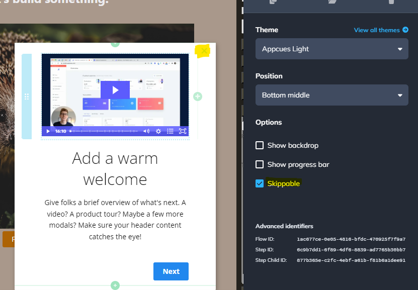
Select a Modal layout from the Type dropdown in the Builder:
| Layout | Behavior |
|---|---|
| Standard | Centered on screen with your app dimmed behind it |
| Sidebar | Slides in from the side of the screen with your app dimmed in the background |
| Full screen | Covers the entire viewport — the app is not visible at all |

Slideouts
Slideouts are smaller overlays that appear at the edge of the screen. They're less intrusive than Modals — users can still see parts of your app behind them. Use Slideouts for feature announcements, feedback prompts, or upgrade nudges.
Slideouts support nine positions on the screen. The default is bottom-left. To change position, select a different option from the Position dropdown in the Builder.

Configure background color
Set the background color and main font color for Modals and Slideouts in your Theme. Open the Theme editor and adjust the colors under the pattern configuration section.

Configure the backdrop
The backdrop is the dimmed overlay behind a Modal or Slideout. It controls whether users can interact with your app while the step is visible.
- Opacity at 0% — no visible backdrop. Users can see and interact with your app.
- Opacity at 100% — fully opaque backdrop. Your app is completely hidden behind it.
- Any value in between creates a semi-transparent overlay.
A backdrop blocks users from clicking on your application elements behind it.
Configure the backdrop in two places:
- Theme — set the default backdrop color and opacity for Modals and Slideouts. Modal backdrops can only be configured in the Theme.
- Builder — toggle the backdrop on or off for individual Slideout steps. This overrides the Theme setting for that step.
Enable a progress bar
A progress bar shows users how far they are through a set of steps. Toggle it on in the Builder's step settings.
The progress bar tracks progress within the current step group only — not across the entire Flow. A separate Tooltip group later in the Flow has its own progress tracking.
Progress bars are supported on Modals and Slideouts only — not Tooltips or Hotspots.
Make a step skippable or required
Toggle the Skippable option in the Builder to add an X button in the top-right corner of the step. When a user clicks the X, Appcues fires a step_skipped and flow_skipped event and ends the Flow.
If skippable is turned off, the user must interact with the step (typically by clicking a button) to continue or dismiss the Flow.
For details on how skip behavior interacts with backdrops across all pattern types, see Make Flows skippable or required.
How step progression works
Modals and Slideouts require a button to advance to the next step. If a Modal or Slideout has no button and there are more steps after it, the user has no way to continue the Flow.
Always add at least one button with a Next step, Go to URL, or Dismiss Flow action to every Modal and Slideout step.
How step completion is tracked
Modals and Slideouts use different completion logic for targeting conditions and analytics.
For targeting conditions
Modals and Slideouts are tracked as "has been seen" — the step counts as complete the moment it renders on screen. No user interaction is required. This means targeting conditions in Studio show "has been seen / has not been seen" for these step types.

For analytics
In Flow analytics, a Modal or Slideout group is marked "completed" when the user dismisses the final step in the group through one of these actions:
- Clicking a Next step button (on the last step in the group)
- Clicking a Go to URL button with "Mark flow in progress as complete" selected
- Clicking a Skip to Next Group button (completes the Flow when this is the last group)
- Clicking a Dismiss Flow button with "Mark flow in progress as complete" selected
- Clicking a Trigger Appcues Flow button
Clicking the built-in X (skippable) button does not count as completed — it fires a
flow_skippedevent instead.