Mobile Modals and Slideouts
Learn more about the types of mobile steps you can use and how to edit and style them.
Table of Contents
Adding, deleting, and reordering content blocks
A new content block can be added by selecting the blue ➕ that displays when hovering above, below or to the side of a step when in step mode, to switch to step mode click outside of the modal preview area or click on the step you're working on in the bottom builder bar.
Content blocks can be reordered by hovering over a content block that isn't actively being edited and clicking and dragging to the new desired location.
An entire row can be reordered by dragging the handle that appears on the right of the row and moving it to the new position.
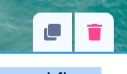
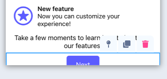
Clicking on a block will display the controls for that block.
The copy icon will create a new copy of the block that was selected with the current contents and styling.
The trash can icon will delete the selected block.
Mobile Modal Step Types
Mobile Modals have a number of step types that control how that step is displayed on the mobile device.
-
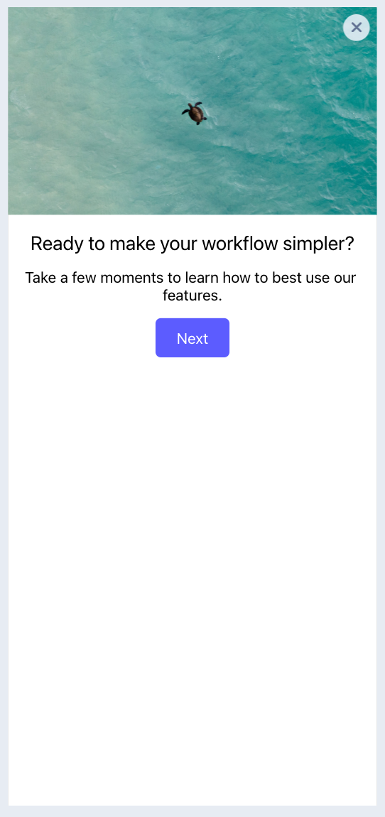
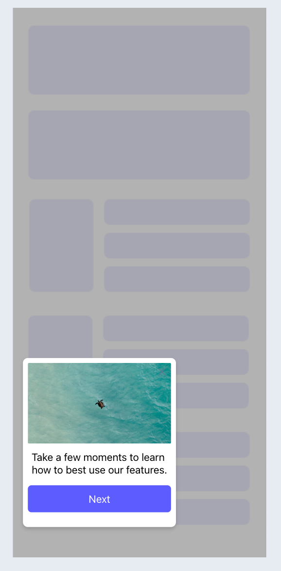
Standard - a modal with visual space on all sides of the modal.
Standard Modals have an additional positon control allowing the experience to be aligned to the top, center, or bottom of the screen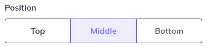
-
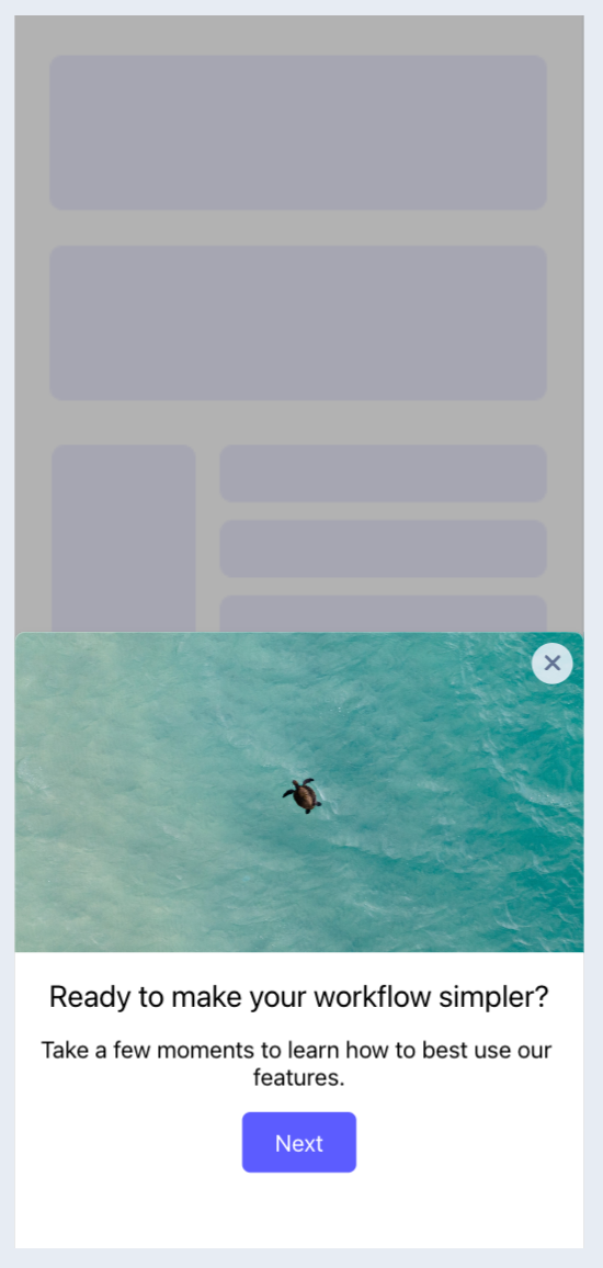
Full Screen - a modal that fully covers all visual area on the screen.
-
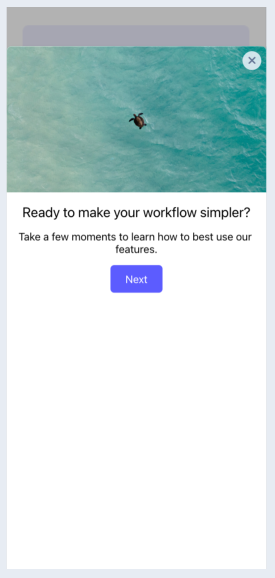
Half Screen - a modal that is aligned to the bottom of the screen with visual space to the top of the screen.
-
Cover Sheet - a modal that covers the majority of the screen with minimal visual space to the top of the screen.
-
Slideout - (Supported in SDKs 3.1 and above) an unobtrusive experience that has visual space on all sides, and can be positioned in any primary quadrant of the screen.
The Slideout pattern has a position setting to specify the quadrant on the screen where the Slideout will display and animate from.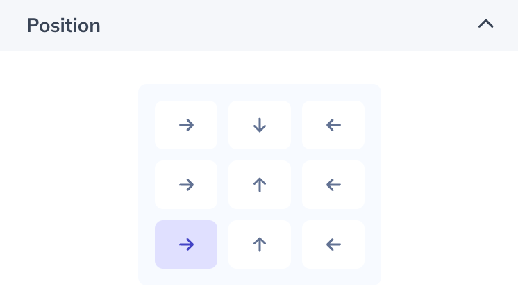
Edit and styling content blocks
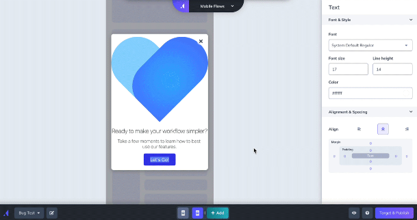
To style and edit content blocks, click on the block and the Mobile Builder's sidebar will display corresponding styling options. Depending on which content block you are adjusting, you can select style options such as color, size and spacing, and corner radius.
- Appcues Assistant - This option is powered by OpenAI and is a great option if you need a little help with your copywriting. For assistance managing AI features in your account contact support@appcues.com
- Image/GIF - You can upload a new PNG, JPG, SVG, or GIF image. Note, for best performance, small optimized images are recommended under 2 mb 1620x1620. Previously uploaded images can be reussed by choosing the “select from image gallery” option when adding an image.
- Text - The font dropdown features default iOS and Android options. You can add a custom font by clicking the “add custom font list” button at the bottom of the dropdown - you must enter the exact desired font name in the input. Please note that some custom fonts won't render in the mobile builder, so it’s best to use the preview functionality to see exactly how it will look on a mobile device. You can also use the mobile debugger tool (once you've installed the SDK) to view what fonts are available in your application.
- Video - Add your videos from common video services like YouTube, Wistia, or Vimeo to embed videos into a modal.
- Emoji - An emoji can be selected and added to the modal. The emoji that is displayed on the device will use the native emoji library.
- Icon with Text - A block with a customizable icon along with customizable title and text. New images can be uploaded and existing images can be selected from the image gallery.
- Hero/Header - A block with a title, text, and background image. New images can be uploaded and existing images can be selected from the image gallery.
- Text Input - A survey block for open text survey responses.
- Single-select - A radio select survey block where users can select a single response.
- Multi-select - A check box survey block where users can select multiple items.
- Rating - A survey block with Number, Star, and Emoji rating options.
-
Button - To edit button text, click the button text and type directly within it. There are several actions you can assign to a button:
- Go to URL - An input field appears to enter a URL link. This can be either a deep link (to another screen in your app) or a web browser link.
- Next Step - The button will link to the next step in the mobile modal Flow.
- Previous Step - The button will link to the previous step in the mobile modal Flow.
- Trigger Flow - You can select a published Mobile Flow from the dropdown options, and you can optionally specify another screen to be redirected to before triggering the new Flow.
- Dismiss Flow - When selected, you can choose to "Mark Flow Complete" by default.
-
Go to custom step - An additional dropdown will appear that a user can select any of the Flow's steps.
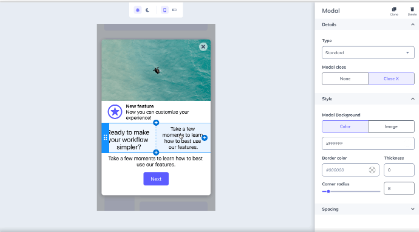
Styling modals
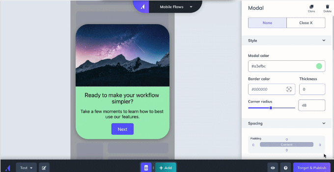
- Modal styling options appear in the right sidebar. If you have clicked into a content block, simply click outside of the modal in the preview pane to populate the modal styling options:
- Position - Available only for the Standard modal type. This will set the vertical location of the modal (SDK v1.3+).
- Modal Close - You can either select the "X" exit functionality that lives in the top right corner of the modal or select “none”, which then requires an explicit "close" action button to be included in the content of the modal.
- Modal Color - Select from the color wheel, or enter a hex color code to adjust the modal color.
- Border Color + Thickness - Available only for the Standard modal type. Select from the color wheel, or enter a hex color code to adjust the color, and enter a number to adjust the border thickness.
- Background - Add a background image for the entire modal.
- Step Indicator - Show/hide and customize step indicators at bottom of a modal.
- Corner Radius - Adjust the slider or input a number to adjust the modal's corner radius.
- Spacing - Enter a number on the spacing matrix to adjust the padding in the modal.
- Dark Mode - Select the ☾ icon in the preview display settings or color selector tool. Updating the color in this mode will update the selected color setting for users viewing the experience with dark mode enabled. If no dark mode color is set the default color will be the light mode color. This is based on a user's overall device settings.
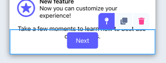
Setting a block to stick to the top or bottom of a modal
Supported in SDKs 1.3 and above.
With the sticky option you can set a block or a row of blocks to stick to the top or bottom of a modal. This will make that row fixed so it will stay in the set position even when other content is scrolled.
To set a row so it is sticky, select any block in the top or bottom row and click the sticky pin. Adding a block to a sticky row will make that block sticky. Removing a block from a sticky row will update it's behavior to the row it's moved to.
To set a row so it's no longer sticky, select any block in the row and click on the sticky pin.
Moving a sticky row to a new position or moving a new row into the position of a sticky row will also make it so those rows are no longer sticky.