Create and style Launchpads
Learn how to create Launchpads with Appcues
Table of Contents
Set up an in-app content center and customize its appearance to match your brand.
Prerequisites
- Access to Appcues Studio
- The Appcues Chrome Extension installed (required for inline beacon placement).
Create a Launchpad
- Go to Experiences > Launchpads in Studio.
- Click Create Launchpad.
- Choose the beacon behavior:
- Floating: A fixed icon that sits on top of the page and stays in the same position while scrolling.
- Inline: An icon embedded into your page layout, positioned relative to a target element. Use this when you want the Launchpad to feel native to your app's navigation.
- Enter a name for your Launchpad and click Create. The Launchpad builder opens.

Set up beacon placement
Floating
Floating beacons appear in the bottom corner of the page.
- Open Settings in the top-left panel of the builder.
- Choose Left or Right to set which side of the page the beacon appears on.
- Adjust the distance from the edge to account for other UI elements in that area.
Inline
Inline beacons are placed into your page using the Appcues Chrome Extension.
- Click Set launcher placement in the settings panel. You are prompted to enter a Preview URL.
- Enter the URL of the page where you want to place the beacon. The Chrome Extension opens on that page.
- Select the target element. The fine-tune position panel appears with three embedding options:
- Inline Left: The beacon displays to the left of the content inside the target selector.
- Inline Right: The beacon displays to the right of the content inside the target selector.
- Overlaid: The beacon is overlaid on top of the content in the area of the target selector.
- Customize the CSS selector and adjust positioning as needed.

Add content blocks
Click the blue + icon in the builder's preview panel to add content blocks. Each Launchpad supports two types.
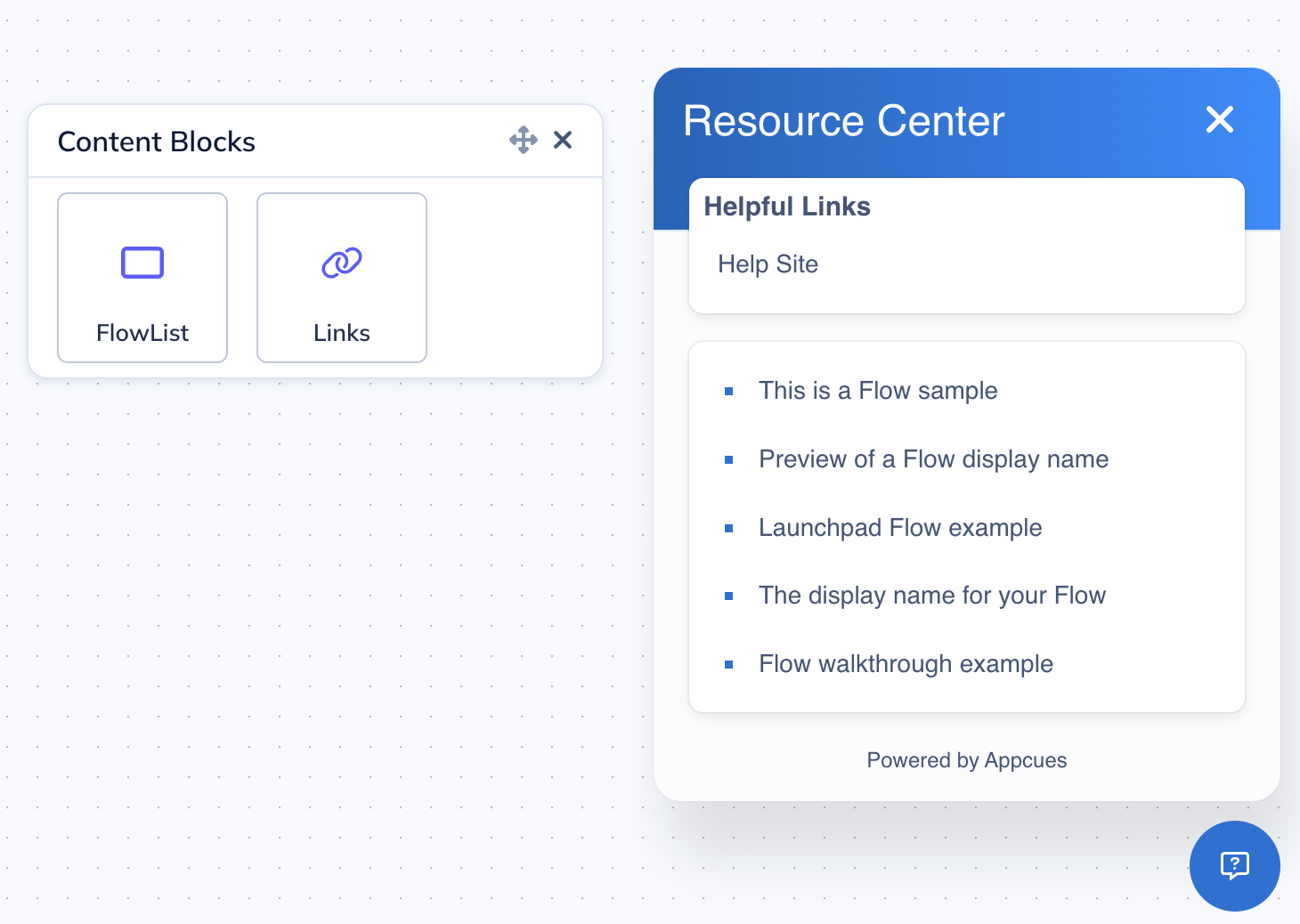
Links block
A Links block is a group of items you define manually. Each item can either open an external URL or trigger a published Flow.
- Click + and select Links.
- Choose a layout — list (vertical) or grid (horizontal).
- Click the pencil icon on any item to edit it:
- Go to URL: Opens an external link (your blog, changelog, support page, etc.).
- Trigger Flow: Launches a published Appcues Flow.
Flows added as items in a Links block are always displayed and do not respect audience targeting.

Flow list block
- A Flow list block dynamically shows published Flows that the current user qualifies for.
- Click + and select Flow list.
- On the Content tab, set the sort order:
- Flow Priority: Orders Flows based on your Flow Priority settings.
- Most Recently Updated: Shows the most recently updated Flows first.
- Set the maximum number of Flows to display.
- Check the Flow List tab to preview which Flows will appear (assuming a user qualifies for all published Flows).
Flows in a Flow list block respect audience targeting. Users only see Flows they qualify for. To configure which Flows appear in Launchpads, see Target and publish a Launchpad.

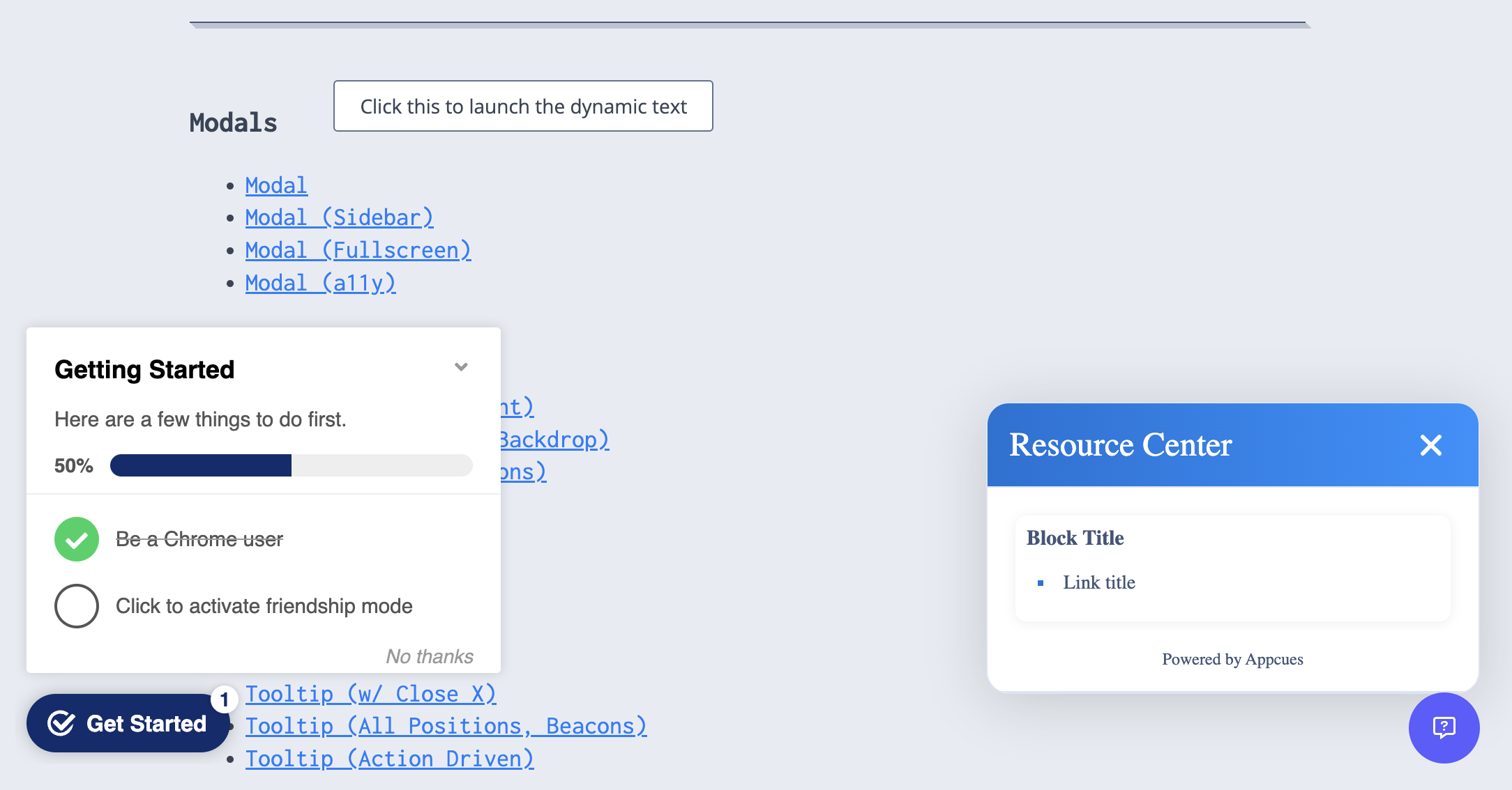
Style your Launchpad
Click the Settings icon in the top-left panel of the builder to open the styling controls.
Container
In the Styles tab, configure the Launchpad's visual appearance. The Font family dropdown defaults to Auto, which inherits the font from your application's page. You can also select a specific font to override it. Primary color sets the background color, and Secondary color applies to the text. Adjust the Border radius to control the roundness of the container corners.
The close button ("x") and title font color adjust automatically based on the background color to ensure high-contrast readability.

Title
Click the Launchpad's title text in the preview to edit it directly.
Beacon
Click the beacon in the preview to open its styling menu. You can customize:
- Padding, color, and border radius of the beacon itself.
- Label: Enable a text label on the beacon. Customize the label's color, size, and style.
- Icon: Choose from a help icon, chat icon, or upload a custom SVG. Adjust the icon's color and size.
You can enable the label without an icon, or the icon without a label.

Links block styling
- List layout: Customize the bullet point shape and color.
- Grid layout: Customize the icon size and background color.
Flow list block styling
Customize the bullet point style and color in the Styles tab.
Launchpad and Checklist icon merging
If a user qualifies for both a Launchpad and a Checklist on the same page and the icons would appear in the same location, Appcues merges them into a single combined icon. The user clicks the respective section to expand either the Checklist or the Launchpad.

If the icons appear on different parts of the page, they display as separate icons.
Localize the Launchpad
Launchpads support localization so you can serve your content in multiple languages. You can translate content manually in the builder, upload XLIFF files for bulk translation, or use AI translation to auto-translate into your configured languages.
To set up localization, click the language dropdown in the builder to enable your target languages and start translating.
For full setup instructions — including configuring languages, working with XLIFF files, and AI translation — see Localize experiences.
Translate Flow names in the Flow List block
After a web Flow has been localized, you can translate the display name that will appear in the Launchpad's Flow List block. Click the Localize display name button in the Localization panel on the Flow settings page. Add your translation in the panel and save.

Confirm it worked
- Open the Launchpad builder and click the preview button (👁️) to verify your content and styling.
- For a full test including Flow list content, publish to a staging environment or an internal tester segment. See Preview and test a Launchpad for instructions.
If the Launchpad doesn't appear
- Verify Appcues is installed on the page where you expect the Launchpad. Open the Appcues debugger and confirm all rows show green checkmarks.
- Check that the user meets the Launchpad's audience targeting rules.
- Confirm the page URL matches the Launchpad's page targeting settings.
- See Troubleshoot Launchpads for a full diagnostic walkthrough.
If the issue persists, contact support with a screen recording, the Launchpad URL from Studio, and the user ID of the affected user.