Mobile Tooltips
Learn how to create attractive and user-friendly mobile tooltips for your native mobile app.
Table of Contents
What are mobile tooltips?
Mobile tooltips are a UI pattern that draws a user's attention to a specific area on the screen of an application. They are ideal for user onboarding, feature announcements, and contextual walkthroughs.
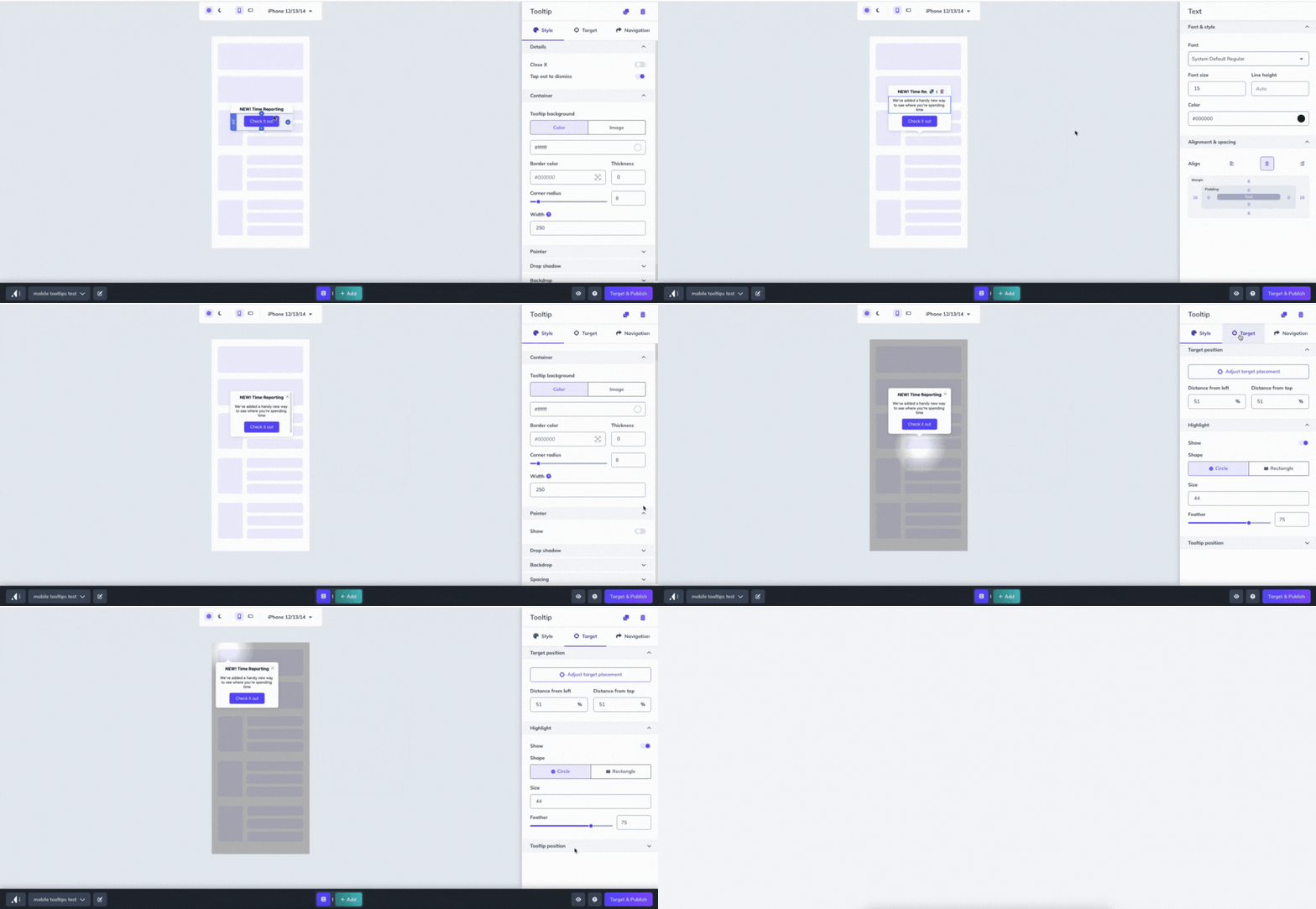
Floating Tooltips
Supported in SDKs 2.0 and above.
Floating tooltips target an area of the screen. They work well when targeting a static portion of the app screen, such as a navigation bar item.
Floating tooltips are supported on all app frameworks, so they are a great option for Ionic users, as we don’t support those frameworks for Anchored tooltips.
Anchored Tooltips
Supported in SDKs 2.1 and above.
Anchored tooltips will target an element on the screen by using a selector to identify the targeted element. The anchored tooltip pattern is only currently available for Native iOS, Native Android, React Native, and Flutter Apps.
Beta support for Ionic Apps
Anchored tooltips support is available in version 5.0.0-beta.1 of the Appcues Capacitor Plugin. See our repo dev doc for more information.
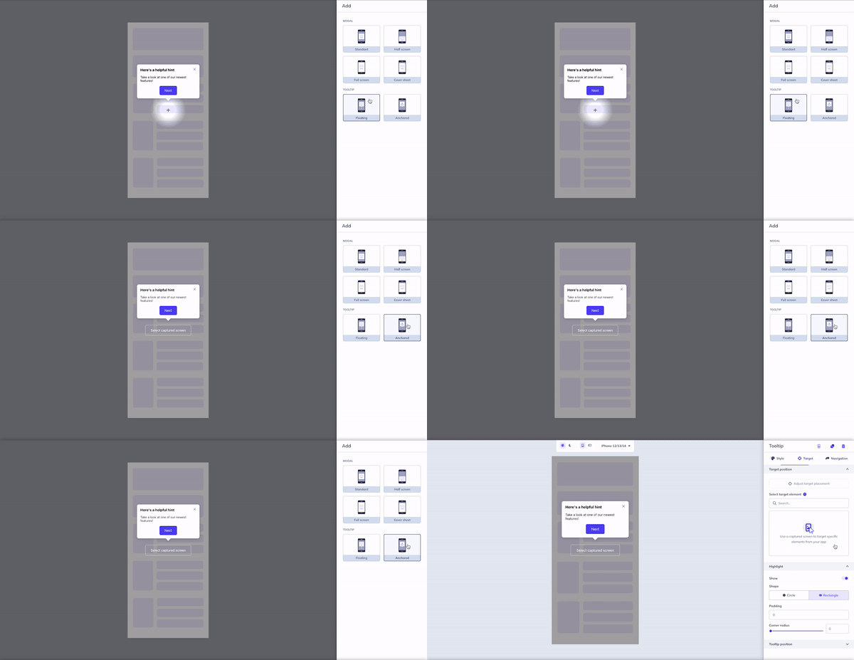
Anchored and Floating Tooltip Content Blocks
Mobile anchored and floating tooltips have the following content blocks available:
- Text
- Image/GIF
- Hero/Header
- Button
- Emoji
- Icon w/ text
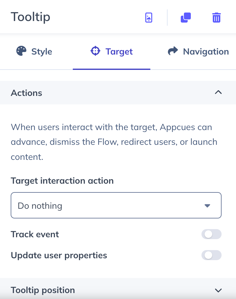
Tooltip Target Actions
By default the tooltip target area is set to Do nothing. This means that if a user taps on the target area of the tooltip nothing will happen.
The target interaction action can be updated to do any of the following:
- Do nothing
- Next step
- Go to link
- Trigger flow
- Dismiss flow
- Go to custom step
In addition to the target interaction, the target area can be set to trigger either of the following:
- Track event
- Update user properties
Styling Anchored and Floating Tooltips
Anchored and floating tooltips have the following styling options:
- Backdrop - Allows the user to darken the app screen behind the tooltip to draw more attention to the area the tooltip is calling out
- Drop shadow - The shadow effect behind the tooltip pattern that adds dimension to the pattern type in relation to the app screen background
- Highlight - Adds a “keyhole” aesthetic to an area or element depending on the user’s settings- the user has the ability to control the sizing and feathering effect of this design option
- Pointer - Allows the user to turn the pointer on and off, and adjust the pointer’s dimensions
Placing and Adjusting Floating Tooltips
On the styling sidebar, a user can click the “target” tab and use the relative position percentages, or click the “adjust target placement” button to use a cross-hair pointer and select a relative position on the preview pane. To adjust the placement, select either “top,” “bottom,” or auto - (note: this is preferred placement - if you select “bottom,” but the target is already at the bottom, the tooltip will automatically move to the top so that it fits in the screen.)
You can also adjust the distance from target by inputting a value.
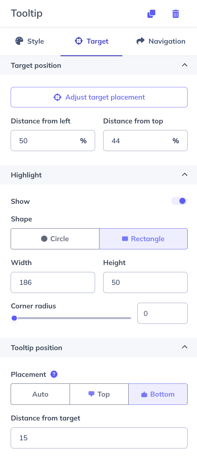
Placing and Adjusting Anchored Tooltips
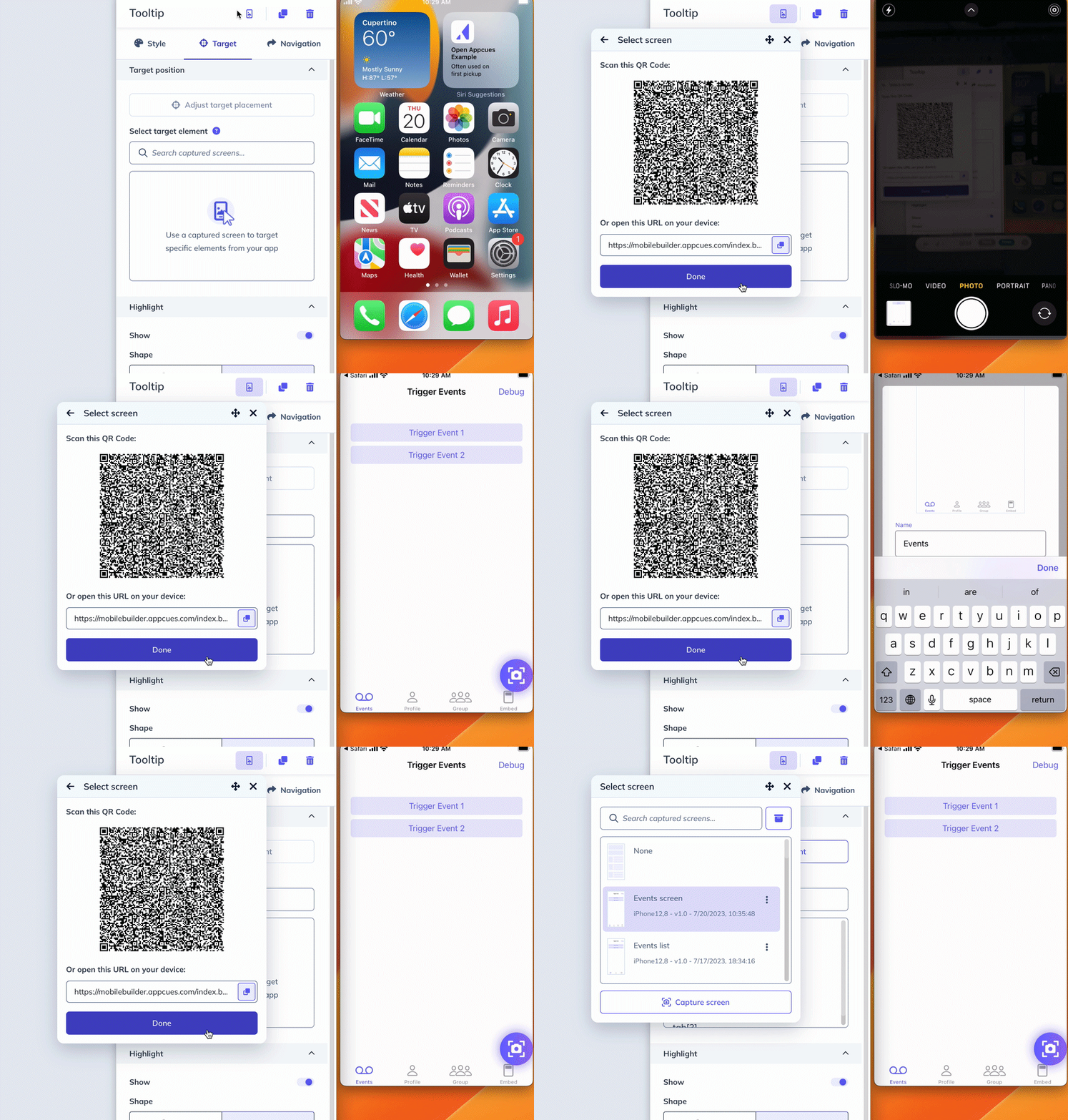
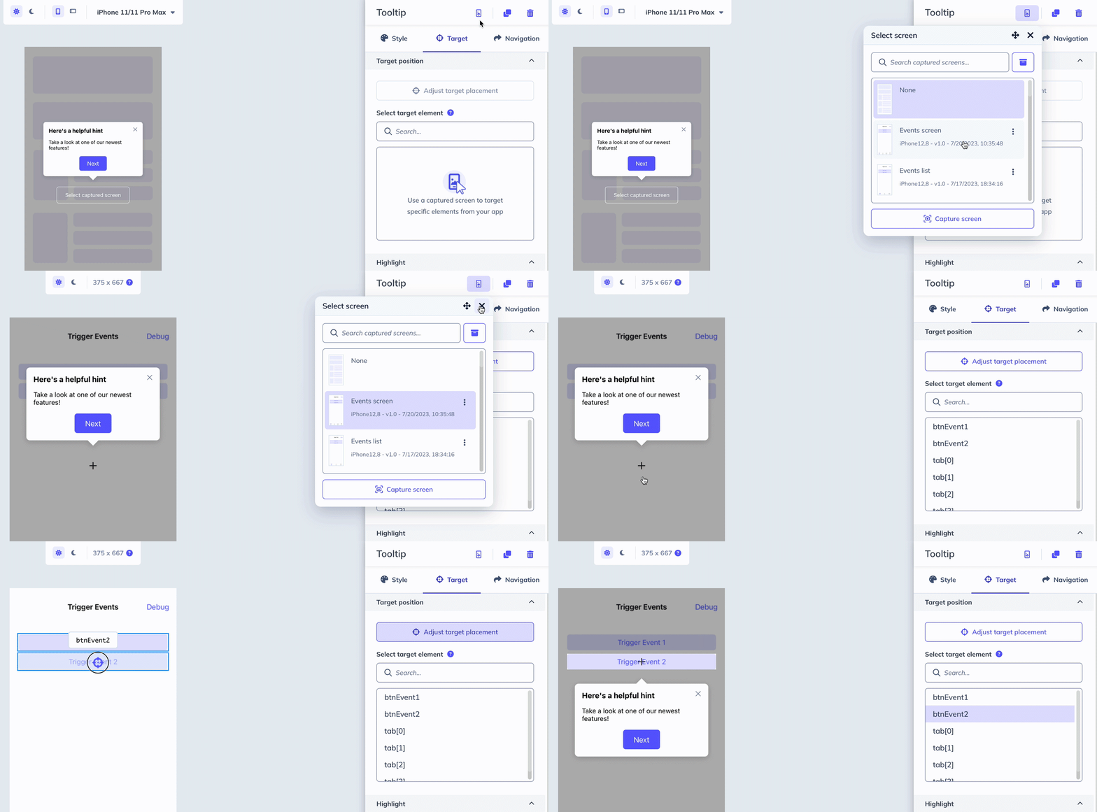
In order to use the Anchored tooltip pattern - a screen capture must be selected or uploaded. You can click “select capture screen” on the preview pane or from the screen capture icon on the top of the sidebar.
The screen capture will then populate the targetable elements that you can select from either the app screen preview or the list of selectable elements on the target tab sidebar.
To adjust the placement, select either “top,” “bottom,” or auto - (note: this is preferred placement - if you select “bottom,” but the target is already at the bottom, the tooltip will automatically move to the top so that it fits in the screen.)
Deep linking configuration is required to use the QR code screen capture for anchored tooltips. Read our article Configure Mobile Deep Links to learn how to configure.
FAQ
How do tooltips progress? Can an end-user click an element to progress the flow?
Yes, the target interaction action can be set for any tooltip and when the user clicks on the target area the interaction will be triggered. To have the user progress to the next step in the flow you can set the action to Next step.
Can an end-user interact with elements on the screen while the tooltip is currently showing?
No, the end user is not able to interact with the app functionality while a tooltip is displayed. There is an option to set the tooltip details as “tap out to dismiss,” so the tooltip flow will dismiss if the end-user clicks the screen outside the tooltip.
Yes
Yes - see documentation here
Can a user anchor an element that is off-screen? (When the end user scrolls, they will see the tooltip)
At this time, we don’t support the ability to target an element off-screen that the user would have to scroll to.
In addition, the end user can not scroll while the tooltip is showing, as they cannot interact with the app screen while a tooltip flow is presented.
Troubleshooting
Why isn't my screen capture populating targetable elements?
Ensure your developers have set up your app to allow common elements to be identifiable.
Please find relevant technical documentation outlining that process below: