Best Practices for Building Flows with Appcues
This practical guide will walk you through the best practices for building flows with Appcues.
Here are the Dos and Don'ts recommended by our team at Appcues to build flows that create engagement and drive adoption!
Dos
-
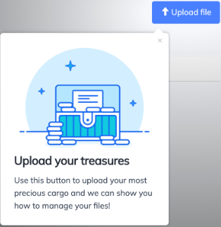
A single tooltip is the most effective way to drive feature adoption. Rather than interrupting the user with a large overlay or multi-step flow, use a single tooltip to call out a new item on the screen (targeted to only relevant, post-activation users), and measure increased adoption rates over a period of 7-30 days. Users may not be ready to investigate it at the moment but are more likely to read your single tooltip than all the content you might add to a slideout or modal, so they become aware of the feature and are more likely to check it out later.

- Trigger feature announcements to relevant users after they’ve seen a couple of page views in the current session. Users are less likely to read your feature tip if they feel bombarded the second they log in. They are more likely to read it if they’ve had a chance to do the first important task they logged in to accomplish and then are presented with your tip.
-
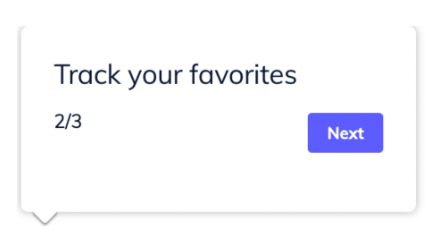
Add step numbers to your flows to increase completion rates, so users don’t wonder if it’s going to go on forever.

- Have short flows waiting for users on each subpage of your product. That way, the first time they land on that page (whether it’s in session 1 or 100) they’ll be met with a quick guide to how to see value from that page. Stick with 1-3 tooltips whenever possible, but slideouts on the side of the screen work too. Just don’t use Modals!
-
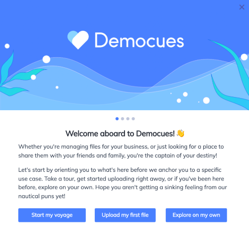
Always give first-time users an “out”, rather than forcing them to walk through an onboarding flow. Many users will have “dashboard anxiety” and just want to poke around before being forced down a path. You can nudge users who chose to “just explore” back on track after X number of pageviews or on their second login if they still haven’t completed the first key action.

-
Create an onboarding checklist (or multiple versions for each persona, if needed) that follows the critical path to activation. Each item of the checklist should be action-oriented. Use event properties to check off the checklist items rather than checking off an item based on the user seeing the related walkthrough or step-by-step guide. This will allow your checklist to support multiple learner types because those who choose “just explore” from the welcome modal will still get a toast if they take the right actions, and seeing the checkmark will motivate them to follow the rest of the Checklist prompts, especially if you didn’t immediately frustrate them by forcing them down an initial onboarding path.

-
Leverage a frequency cap to prevent over-exposure. In the Appcues dashboard, configure a frequency cap at the Segment level for “regulars” and “champions”; e.g. “last content shown occurred more than 3 days ago”. This will prevent your frequent users from being overwhelmed and frustrated by tips and announcements on every log-in or page load, even if your teammates create and publish additional flows to the same audience.

Don'ts
-
Modals should only be used as a welcome! An exception to this rule is any time a modal is used in a passive flow that users are explicitly opting into. For example, if you’re using the Launchpad feature, this is a good place to include flows with modals containing more content, because the user is choosing to launch this flow, so the full-screen takeover isn’t nearly as overwhelming. This pattern can also be used if you’re having a major redesign or another reason to forcibly block the user from accessing your product (e.g. a trial expiration modal).

- Don’t use beacons for tooltips. Reserve them for hotspots, or users will try to click the beacon rather than the element it’s pointing to.

-
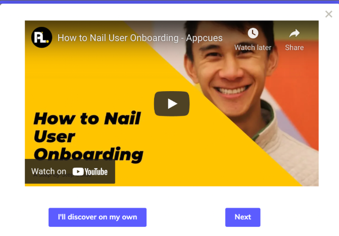
Don’t expect the majority of your users to watch embedded videos. Videos are a great way to support visual learners, but that will only be a percentage of your customer base, so videos should always be optional and should never be the only way you’re showing users how to use your product. Wherever possible, also give users the option to be walked through taking the right action themselves.

- Don’t create a true product “tour”. Users don’t want to be walked through every feature of your product when they first log in. They want to know how to get to the value they signed up for. Drive them towards their first moment of value as quickly as possible, and then use the concept of progressive disclosure to introduce more features and functionality as it becomes relevant to that particular user, or as they become ready for it. Readiness should be measured by product usage & behavior, not the time since signup.
- Don’t start a flow with a navigation step. If the first thing a flow does is redirect the user somewhere else, it can give the impression that something is going wrong. It's best to let the user see the first step of a flow before then sending them somewhere else so they're aware this redirect is expected and not a bug. And because a navigation step operates differently than all the other flow step patterns, a flow that begins with one won't display any information, such as recent users, on its analytics page (but the flow events can still be viewed by exporting the flow's CSV!)
Need help with your flow? Please reach out to support@appcues.com, we're happy to help!